Tuesday 28 May 2013

Diamonds are a Girl's Best Friend - Hels' Sunday Stamper Challenge

Hi All!  Hels' challenge this week revolves around embossing, and UTEE (Ultra Thick Embossing Enamel), which is lovely stuff.  Her challenge is Some Like It Hot (because you have to melt UTEE/embossing powder to make it work).  When I heard that, I thought of Marilyn dancing with all the chaps, and singing Diamonds are a Girl's Best Friend.  Yes, yes, I know, that's Gentlemen Prefer Blondes, but there's no accounting for how my neurones work! So this is my entry for that challenge.


The painted background is meant to evoke a red silk dress, or a theatre back drop.  This is acrylic paint in a few layers, including the lovely London Bus from PaperArtsy, which is so tranlucent! Mmmm.

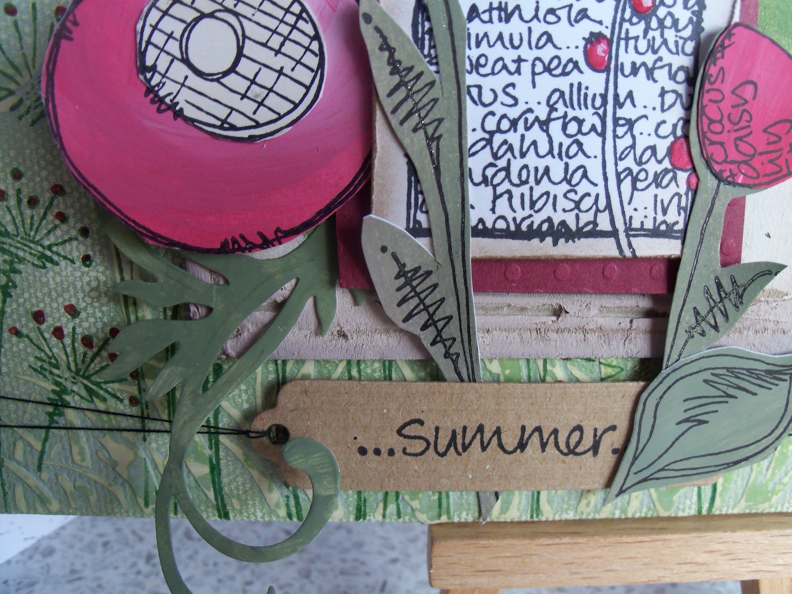
The background stamps are shadow stamping using Brilliance, so it is a bit hazy, intentionally!  The words are stamped and heat embossed.  When that was dry and cool, I used a quickie glue pen and some ultra fine glitter to add a few more sparkles.  You can never have enough bling!!

On to the UTEE. There are a couple of different mixes in there, so I am not quite sure what colours made which element.  The beads and the frame are both made using a Gedeo Silcon mould.  You might spot that there is glass glitter in there, too, just in case any more bling was needed!  I wasn't sure if it would melt into the UTEE, so I tried sprinkling it into the mould on for the frame and one of the strings of beads, and adding it into the UTEE for the other string of beads.  It definitely has more impact by sprinkling it into the mould.

Inside the frame are my diamonds, which I discovered in a home decor shop, a box full of different sizes for two quid.  Don't think they are real...but they ARE shiny!!  I've adhered them with silicon glue - what a pong!!   Because this goes on cloudy and only goes clear when dry, you have take a bit of a leap that there's enough diamonds in there, to cover it all.  I am a little disappointed that actually the silicon glue isn't THAT clear.  That may be because it has only been drying for 24 hours, and there is some more drying to do, OR I guess, it may be that I crammed so many diamonds onto that area that the air couldn't get at it! 

While I had the Melt Pot out, I thought I would have a go at making a mould from a pair of cufflinks I had, which are bees.  So I mixed up some Siligum (this has two different plasticine-like doughs, which you mix well, then you press your item into it, and count to 10.  Remove your item, and bingo!  A mould!!  I haven't used Mould and Pour, but I guess it works in the same way.) I used the bits of UTEE after making the frame and beads for the bees, because they didn't take too much, and I didn't really mind if they didn't match, because I wasn't going to use them on THIS project.  So now I have two moulds for bees!  A good luck symbol for the chinese!

Hope you like!


Materials used

Substrate: Stamps Away Medium Tag

Paints and inks
DecoArt Americana: Lamp Black, Light Buttermilk, True Red
PaperArty Fresco Finish: London Bus
Brilliance: Rocket Red, Mineral
Versamark dazzle: Frost

Stamps
Stampin Up: Broadsheet Alphabet
Stampers Anonymous: Sketch Elements CMS054
Hero Arts: Happy Upper Case LL243


Bling and other stuff
Ranger Melt Pot
Ranger UTEE: Platinum, Clear
Cosmic Shimmer UTEE: Silver Shine, Blue Raspberry
Cosmic Shimmer Embossing Powder: Viola Black Aurora
Stampendous Embossing Powder: Detail Gold, Detail Silver
Stampendous Frantage Glass Glitter: Black
Martha Stewart Glass Glitter: Silver
Gedeo Silicon Mould: Frames/Picture Frames
Art Glitter: Heart Medallions (gold)
Silver glitter (unnamed)
Siligum
Quickie Glue pen

Wednesday 22 May 2013

JOFY - workshops at the Stamp Attic

Last weekend, I was mostly at the Stamp Attic, hardly worth coming home really!!

Saturday was card making, and Sunday was a wall plaque, both with the JOFY stamps from Paper Artsy, and led by JOFY - Jo Firth-Young herself.  Two great days, really fun, really productive.

These are the cards from Saturday's sessions.  Jo's card were more pink than mine, as I really wanted to go down a blue route, not using Blood Orange quite as much as she did!! (Blood Orange is a lovely colour, honest, but I love love love the Pea Coat, which is a gorgeous translucent blue.  Of course, it found its way, with several friends, and some more of the JOFY stamps, into my basket...)


The wall plaque is an 8x8 canvas board.  This has loads of layers on it, and lots of sanding.  I killed a sanding block!  The Grunge Paste from Paper Artsy is extremely hard wearing!!  The flowers are predominantly Blood Orange (see, I CAN stick to the rules!).  Jo showed us a great way to use paints to create the base for her stamps, which we used both days.


HUGE thanks to Jo for putting up with me, and sharing her knowledge and insights (and providing us with a cool circle template!!), and to Wendy at the Stamp Attic for hosting these sessions.  Great fun!


 Materials

Inks and Paints
PaperArtsy Fresco Finish - I know I used these (but there were others, I think!):  Pea Coat, South Pacific, Toad Hall, Tinned Peas, Nougat, Blood Orange, Haystack
Distress Ink: Wild Honey, Picked Raspberry, Spiced Marmalade
Archival: Olive Green, Jet Black

Stamps
PaperArtsy JOFY, the full range!

Bling and other stuff
Andy Skinnner Baroque Stencil
TCW (I think!) Clocks Stencil, Agapanthus stencil
PaperArtsy Grunge Paste
Sakura Gelly Roll Pen
Spellbinders die cuts
Stickles

Craft Artist - using punches

Today is a catch up day - could be three posts!  Today is the birthday of one of my old school friends - yes, we are all getting older!  Last week, I made this card for him, and want to thank Michelle Jackson-Mogford for her demo on C&C!  Made all the difference!

For people who don't know, Craft Artist is amazing (I don't use it, or my Cameo enough).  It enables you to create stuff digitally, which you can email to people, or print out and do some real crafting, to engineer a hybrid tangible thing.  And it is this latter thing I did for Timo's card.


Here is the base piece created in Craft Artist.  It is the punch tool, combined with drop shadow that makes it look like more than a flat page.  But that is what it is!


I printed it out, and then added some accents using a pearl pen, which accentuates the punch effect created in Craft Artist.  The only things that are 3d are the 5 pearls in each corner, the pearls on the name and on the cogs.  Otherwise the piece is one piece of card added to a kraft base card, which went into the envelope.  Nice and flat (cheap!) for postage!!


Materials

Kraft 6x6 card
200gsm white card
Viva Decor Pearl Pen - Haematite
Craft Artist Professional 2
Angie Hinksman True Blue Digikit
DaisyTrail Vintage Sideshow Digikit

Antique Writing - Hels' Sunday Stamper Challenge

Hels' challenge this week was 'All Those Years Ago', the fantastic George Harrison song.  Whilst I was made all those years ago, I can't enter myself, so I made a tag! 

Seemed to have forgotten to take photos throughout this time, sorry.

Started with a die cut tag, which I covered with torn up book pages (this STILL makes me shiver - I keep looking over my shoulder for the book police...).  I mixed a very pale combination of light buttermilk and Transparent Yellow Iron Oxide - I wanted to keep the paint translucent to allow the book's text to show through.

Over the top, I used a lovely text stamp, I think it's old french, and then when that was dry the chinese (I am guessing here!!) text in red.  And you might spot hieroglyphics in there too.  Some of the text has been heat embossed with gold (at the top of the tag).  I have to admit to this being a boo boo.  I thought the french and chinese text was dry when I added the hieroglyphics...whoops, it wasn't!  However, as with most boo boos, actually it worked, mainly because I didn't put the powder all over the card, but kept it over to that top left hand corner.  I restamped the scarab and the ankh in black.

The writing hand was stamped and embossed with embossing enamel.  I really love this enamel! It's made up of several colours, and while they do melt, you can see the gold, silver and pewter independently.  Oooooh, scrummy....

I distressed and inked the edges, stamped the title, and finished it it off with a bow! 

Materials used

Ink and Paint
Decoart Americana - Light Buttermilk
Decoart Traditions - Transparent Yellow Iron Oxide
Distress Ink - Tea Dye, Fired Brick, Walnut Stain
Versafine - Onyx Black
Versamark Dazzle - frost

Stamps
Paper Artsy - Mini Hand MN31, Backgrounds 6 BG6,  Hot Picks backgrounds HPXT01
Hero Arts - alpha peg stamps LL762
Random hieroglypic stamps - no name on them!!

Bling and other stuff
Claudine Hellmuth Studio Matte Muli Medium
Book pages
Stampendous Embossing Enamel - Aged Taupe
Ranger Satin Embossing Powder - Queens Gold
Hessian 'ribbon' and Bakers twine

Tuesday 14 May 2013

Resisting Art (Hels' Sunday Stamper and Tando Creative)

Hi all!  Today I have being resisting temptation...not!  I am like Oscar Wilde, I can resist anything except temptation...and bling (and a Picnic, today, which I found in the drawer...)!  So, Hels set a challenge based on 'simply irrestistable' and Tando set a challenge on purple, white and blue.  I thought I'd join them up.
 
I started with a gold/bronze coloured tag, cut with my sizzix die.  I stamped it with versamark and embossed in clear.  I don't have Distress Paints (will they be my next big thing?), so I hit my lovely Distress stains and that gorgeous Distress ink pad, shaded lilac.  Mmmm.  There are a lot of layers of ink on there.

I edged it up with ink, and doodled an edge, too.


Meanwhile, I ripped out three pages from a junior encyclopedia (still feels like a very wrong thing to do), inked them up with the same colours, and die cut the tattered florals, as Hels did.  To bring the Tando challenge in, I went round the end of most of the petals with a white journalling pen, to make them pop a bit more.  The others got a touch of Distress marker.

On the Tag die is also this lovely bookplate.  The surround is the same base as the tag, a bronze pearlescent card.  I stamped using the versamark again, but this time used a gorgeous Cosmic Shimmer embossing powder, Denim Lilac Aurora. Just amazing!  Then versamark all over, with detail clear, and effectively triple embossed over the top of the text embossing.  Then out with the versamark pen, to emboss the edge of the centre, which I had already coloured.  I stamped Art with picket fence stain.

Finally, as it needed a little something, I made up the charms and suspended them - so now it wouldn't sit on my easel!!  Looks great on the wall tho!

Hope you like!


Materials

Ink
Distress Ink - Chipped Sapphire, Shaded Lilac
Distress Stain - Picked Raspberry, Peacock Feathers, Chipped Sapphire, Picket Fence
Distress Marker - Chipped Sapphire, Dusty Concord, Worn Lipstick
Versamark Dazzle - Frost
Inkssentials pen - Opaque White

Stamps
Studio 490 - Just Word Art SCS033
Image Tree - Text stamp

Die Cutting
Sissix - Tag and Bookplates 656938, Tattered Florals 656640

Bling and other stuff
Cosmic Shimmer embossing powder - Denim Lilac Aurora
Stampendous embossing powder - detail clear
Idea-ology - pins and jump rings
Brads and charms from stash

Monday 13 May 2013

K is for...(Craft Barn Challenge)

Hi all!  The letter this time for the Craft Barn Challenge is K.  Spoiled for choice again, not helped by, having decided on Knight, having Monty Python going round in my head.... your mother was a hamster, and your father smelt of elderberies.  Darn!  May have to get the DVD out (again)!!

So, K is for:  Knight, King, Knave and Keyboard!  Having rediscovered my lovely Darkroom Door stamps for a chess board, and then the Alterations embossing folders for the playing cards, mostly this was about what colours, and what layout to use.


Because there would have been too much going on for a single flat page, I went for a fold out page again (there are a few of these in my alphabet challenge now), using gold mirri as the folding base.

 
As usual, I used the wrong side of Centura Pearl for the base of the chessboard detail, as it takes stamping, and behaves quite nicely with the embossing paste, too.  The embossing paste went on first, through a checkerboard mask.  When it had dried, I replaced the mask, and dabbed on some distress ink.  So the red and black squares in the opposite corners are raised.  When that was dry, I stamped and heat embossed the knights and kings, and then stamped over the other pieces (bishop, prawn etc) and the smaller checkerbard stamp.


Inside, the king and knave embossing folders have been used with black and red kraft core, and sanded back to reveal the kraft colour.  Almost a winning hand!


Inside opposite has the dictionary definitions, mounted on to some black paper, which I had sprayed my favourite two mica sprays and used a crown (?krown?). There's also a great keyboard from a mask I have had never used before.  I added the definition with a really fine journalling pen.  This page is a fair bit more blingy than the picture suggests!

Finished off, to match the rest of the collection, with a wooden K, glued to a flag.

Hope you like!

Materials

Inks
Distress Ink - Festive Berries, Black Soot, Old Paper, Walnut Stain
Versafine - Onyx Black
Versamark - dazzle frost

Stamps
Darkroom Door - Essentials7 Fun and Games (DDRS070)
Creative Expressions - Vintage Aviation

Bling and other stuff
Cosmic Shimmer Vintage Mist - Tarnished Gold
Perfect Pearls Mist - Interference Red
Idea-ology Mini Mask - Regal
That Special Touch Border Mask - Keyboard
Sizzix Alterations - Playing cards embossing folders
Stampendous Embossing Powder - Detail clear, Detail White, Detail Gold
Prima Marketing (Sunrise Sunset) Mask - checkerboard


Saturday 11 May 2013

Diamonds and Pearls (of Wisdom) - Hels and Clarity

UPDATE:  SO chuffed!  This made the top 5 of the Clarity Challenge (please note new blinkie down on the right hand side!  Whoop whoop!!

Morning!  Had to wait for glue to dry properly before I could take the photos, or I would have put this up yesterday.  Still, better late than never!


Hels Sunday Stamper Challenge this week was Diamonds and Pearls (another great song, Hels!), but I also had going round in my head the challenge from ClarityStamps 'It's all in the sentiment'.  I decided to combine the two challenges into the piece above.


The base is a Stamps Away fob watch, without the hands, which fits the sentiment that I wanted to use from Clarity.  I also love the dragonfly from Clarity, so this sort of designed itself!

To bring in Hels' challenge requirements, I clearly added my favourite bling, sticky diamonds and pearls (almost too easy!), but also used the diamond strip from clarity which was one of the designs for the Clarity Club a couple of years ago.  The benefit of this strip is, because it isn't mounted, it can be bent a little, to go around the bezel of the watch.

I finally got round to using some of my Frantage enamel embossing powder.  Why have I left this so long??  Woooo, lovely!  It's the aged rose on the diamonds, and aged taupe on the sentiment.  Mmmmm.

For dimension, I opted for both Clearly for Art (for the dragonfly), and shrink plastic for the flowers.

Hope you like it!!


Materials

Substrate: Stamps Away Fob Watch

Inks
Distress Ink: Mustard Seed, Victorian Velvet, Shaded Lilac
Distress Stain: Vintage Photo, Brushed Pewter
Distress Markers: Bundled Sage, Peeled Paint, Fired Brick
Stazon: Royal Purple, Hydrangea Blue, Fuschia Pink
Versamark: Dazzle Frost

Stamps
Claritystamp: mounted Life is not measured, mounted Dragonfly, remountable Diamond Strip, remountable Petals set, remountable Flower set

Bling and other stuff
Stampin Up: Rhinestones, Pearls
Stampendous Frantage Embossing Enamel: Aged Rose, Aged Taupe
Clearly for Art Clear
Shrink Plastic Clear

Thursday 9 May 2013

Double Embossing - EWV MAC #10

The current challenge for the Everything Wendy Vecchi Group was double embossing, in line with Wendy's tutorials.


I started by inking up the heart stamp with two colours of Brilliance.  Because Brilliance isn't a permanent ink, I immediately embossed with detail clear powder.  Then used a versamark pen to fill in all the blank areas in the heart and embossed again with the clear powder.

I inked up the rest of the tag with distress ink, and then stamped the brick wall.  The heart resisted the ink from the bricks, tho it looks like I missed wiping a little off, because when I added the gorgeous blue/gold embossing powder, a little bit did stick and then melted on the heart. Rats.

I flicked a bit of water over the distress to create freckles.

I love Wendy's 'Pillow Ticking' stamp - as a kid we had pillows with this lining!  I love it even more now I realise I can use it to create a criss cross pattern!  How great!  Unfortunately, the two colours I chose are too similar, but it would be really cool with really different colours.

I coloured up the baker's twine with distress stain, and added a Hope tag from my stash...think it is an Idea-ology one.  Finished off with the dotty ribbon through the hole!

Materials

Inks
Distress Stain: Victorian Velvet, Peacock Feathers
Distress Ink: Salty Ocean, Faded Jeans, Squeezed Lemonade, Victorian Velvet
Brilliance: Galaxy Gold, Rocket Red
Versamarker pen

Stamps
Studio  490: Love to Make art (SCS029), Art Fit For a Queen (LCS040), Graffiti Art (LCS095)

Bling and other stuff
American Crafts: Ribbon and Baker's Twine
Stampendous Embossing Powder: Detail Clear, Golden Ocean
Hope tag from stash

Tim's Tags Catchup - March and April

Here are my takes on Tim Holtz' 2013 tags for March and April.   And now, I am up to date!


MARCH
Tim's original for March is here.


I don't have Distress Paints (I suspect that means I don't have Distress Paints yet...), so I have done some substituting for that and elsewhere.  First off, the flowers tucked under the main boss are clearly NOT idea-ology (I really didn't want to waste the couple I had!!) so were really blingy (almost sequin material) and I'm not really sure what I would have used them for otherwise.  They got some good coatings of different acrylic paint, and finished off with some Pearl paint dabber.  I think I probably overheated them, as the paint went a bit bubbly - but hey, that's a learning!!

I also decided to put felt behind behind the die cut, rather than tinsel.  I do like the effect.  And the colours - so different from my usual pieces!


APRIL 
Tim's original for April is here.


Again no Distress Paints, so I had a play with DecoArt and Traditions.  Maybe not quite the same outcome, but actually, not too bad.  I made several 'testers', where I dampened the card first (or not), and swiped afterwards with a babywipe (or not).  The babywipe took off most of the metallic lustre, which was a bit of a shame, but did take the layers of paint back nicely.  I did cover over with the Distress Inks and spritzed with water as Tim did, and that WAS effective.


I love Clearly for Art (almost as much as shrink plastic)!  I knew the wings of my alternative stamp, the bee, would look good raised up, but they really needed to be irridescent, so when I had dried the Archival black ink, I turned the bee over and painted him with Cosmic Shimmer watercolour paint!


In this month's Craft Stamper (dd June 2013), there is a tutorial by Sarah Engels-Green, about making faux washi tape.  Loved the idea!  Instead of using Distress as Sarah did, I used Archival, and edged in Distress.  I used two bits on the tags, and have a nice selection left for the future!!

On the ribbon, again no Distress Paint, so I used a bit of acrylic Paint Dabber, some Distress Stain and plenty of spray mica!!  The Paint Dabber did resist the other stuff a bit, not a lot, tho.

And finally, I KNOW I have those idea-ology letters.  Can I find them?  Can I hell...but I did find the glittery stickers, which I think work with the now glittery bee.

Hope you like them!


Materials
Substrate: #8 tag cut with sizzix die from decent weight glossy card (for both tags)

March

Inks and Paints
Distress Ink - Picked Raspberry
DecoArt Americana - Glorious Gold, Lemonade, Cadmium Yellow
Adirondack paint dabber - Pearl
Dylusions - Pure Sunshine
Archival - Jet Black

Stamping, Die Cutting and Embossing
Spellbinders - Labels 22
Sizzix - Upon a Type strip alphabet (656916), Movers and Shapers Mini Branch and Leaf (657208), Mini Bird and Cage set (657207), Bigz L Tray (657007), flower embossing folder (sorry, no name or number on the folder!)
Hero Arts - Printers Type LC Alpha LL762

Other stuff (not much bling on this!!)
Felt, embellishments, from stash
My Mind's Eye - free papers 'Spring'

April
 
Inks and Paints
Distress Ink - Antique Linen, Salty Ocean, Spiced Marmalade, Shabby Shutters
Distress Stain - Antiqued Bronze
Adirondack Paint Dabber - Terra Cotta
DecoArt Americana - Glorious Gold, Pistachio Mint, Bittersweet Chocolate
DecoArt Traditions - Quinacridone Gold, Aquamarine
Dylusions - Fresh Lime
Archival - Jet Black, Sap Green, Cobalt, Venetian Orange, Monarch Orange

Stamping
Stampotique (Jo Capper Sandon) - Large Bee
Stampers Anonymous - Mini Ornates CMS064, Bitty Grunge CMS089
ClarityStamp - 12" ruler
Hero Arts - Printers Type LC Alpha LL762

Bling and other stuff
Cosmic Shimmer Watercolour Paint - Pale Gold, Frosted Mallow, Crimson Sparkle
That Special Touch Mica Mist - Emerald, Rich Toffee
Perfect Pearls Msit - Interference Red
Making Memories shimmer stickers (alphabet)
Clearly For Art - clear
Idea-ology - Tissue Tape
 

Sunday 5 May 2013

Another Clock!

Back before Christmas, I got my paws on a couple of the Tando Creative Advent Calendars.  I knew I didn't want to do an Advent Calendar - not really my thing, and finally I made my mind up.  A clock!!  I had a clock mechanism, so ALL I need to do was put a hole in the middle, and then it was up for decorating.


I say ALL.  Hmmm.  I spent about an hour looking at it, turning it round, laying stamps on it, and generally prevaricating, sorry, PLANNING it all out.  I decided on neutral colours, using a technique that Kay taught us on the IndigoBlu retreat earlier in the year, sort of.  There, we put all the pieces on, and then washed over with gesso (gee-so-good) to tie it all in together.  With this, I painted in a neutral ish paint, then stamped, then painted over in a REALLY neutral colour, then sprayed with mica sprays.  Oh, you should see this in sunlight!!  Wow, talk about POP!!


I have added palette knife-fuls of decorating paste in places, and used one of the spare circles from the original tando pack to lift the hands out from the base.  Because this was added AFTER I sprayed the mica, I made it look completely different, rather than attempt to try and tie it in.  More mica!  Up close it looks like abalone.  The sealant is a pearl pen.   Also, if you look closely, you'll see part of a Clarity stamp verse from WH Davies  (What is this life, if full of care, we have no time to stand and stare...) which sort of fits with a clock, in my opinion!

The butterfly on the left side of the clock is a Prima Canvas resist butterfly, glued onto Clearly For Art, so I could mould the wings up, to give it some idea of motion.  It was sprayed with Mica sprays to activate the resist, but the mica seems to have sunk in, leaving the ink only as colouriser.

Last thing is to find a nice spot of wall that gets lots of sunlight (and work out what to do with all the circles and christmas bits I have left over)!


Resources
Substrate - Tando Creative Advent Calendar

Paints and Inks
Neopaque White
Winsor and Newton Galeria - Naples Yellow
Archival - Olive, Venetian Orange, Monarch Orange, Cobalt
Mica Sprays - selected from Cosmic Shimmers, Perfect Pearls, Crafty Notions, That Special Touch
Adirondack alcohol ink - Gold Mixative, Willow

Stamps
Stampers Anonymous - Bitty Grunge CMS089
Inkadinkado - Butterfly wing, Water Lily
Sheena - Falling Feathers
Elusive Images - Flowers and butterflies
ClarityStamp - What is this life
IndigoBlu - Roman Numerals

Bling and Glitz and other stuff
Petaloo - flowers
Prima Marketing - Resist butterfly
DecoArt - Decorating paste
Studio 490 - white Clearly for Art
Viva Decor - Pearl Pen (cream)
book pages
bits from stash