Tuesday 24 December 2013

Christmas Cards - With thanks to JOFY!

At the end of November, I went on a brilliant Jo Firth Young weekend, over at my favourite place, The Stamp Attic.  We made a whole bunch of Christmas cards on the Saturday, and a Christmas piccie on the Sunday.

Jo showed us a few different ways to use her stamps (which are GORGEOUS, and really easy to use), and I focussed in on a couple of her samples to make my Christmas cards. 

Never been a one for fussy cutting.  Tho to be fair, now that I have invested in a pair of Lord Timmy's lovely scissors, maybe I'll learn to love it.  Or at least, detest it less.  But, whatever, Jo's Christmas trees are easy to cut out, even for me.  So I made a bunch of my cards in Jo's style, using different papers, and possibly, just a little more stickles!!


I also love Jo's Snowmen, both full and half size!!  Lovely to stamp, and colour in, using (mostly) Distress Inks, with just a little extra doodling.


My other style of card I picked up from the NEC.  The lovely lady from Card-io was making a similar card, and I had forgotten how much I love montage stamping!  So I did a few cards in this style, having bought a couple of the Majestix stamp sets.  And added some stickles...


Hope you like!


I is for...Craft Barn Challenge

I is a whole lot easier than X!!  In my world, I is for ImagineItaly, Index, Italic, and Indigo.  And there's a whole load of ink in there too!


So I started off by painting my centura pearl card with water, and then with the most amazing acrylic ink, iridescent metallic green, yum.  I may never need to buy metallic card ever again!

I dried that off, and then stamped my italic text in indigo (OK it was manganese blue, but hey, a blind man would be glad to see it, as my mum would have said!).


Did you know that that pointy finger is really a printer's mark called a fist or an index? No, nor did I, but I do now.  And it's included, pointing at Imagine (never liked that song, sorry...).

I added the other Italian images, and finished the main piece off by adding a little distress ink around the edges.


This is the last of the Craft Barn letters, so I now have a binder of most of the letters.  I missed out on the first few (M&V), and I will probably catch up at some point.  It's been really good fun.  Wonder what they will throw at us next year!

Hope you like!


Resources

Ink and Paint
FW Liquid Acrylic: Silver Moss
Archival Ink: Jet Black, Fern Green, Potting Soil, Manganese Blue, Watering Can
Distress Ink: Chipped Sapphire, Walnut stain

Stamps
TJ Designs: Viva Italia
Visible Image: Imagine
Artistic Outpost: London Elements
Image Tree: Text stamp

Sunday 22 December 2013

X is for...Craft Barn Challenge

X.  X!  X? Well we all knew it had to happen.  X.  Who knew there would be so few usable words in my dictionary!!  I very nearly went for Xenon (colourless, odourless gas), but a bit difficult to depict.  Opted finally for xanthochroism - a condition in certain animals (esp goldfish) in which all skin pigments other than yellow and orange disappear.  Recently treated myself to a whole bunch of Pebeo fantasy paints, and thought of a carp, a koi carp.

It may not be normal to immediately think of fish, but I have had a strange life...

Anyway.  I cut my Centura pearl to the standard size, with a slight overhang.  I masked off the edges of the shiny side, and stamped bubbles.  Bravely, I drew freehand the koi, using transparent glitter relief paste.  Gotta have glitter, right!?  This is meant to retain the paint, but note to self, build the retaining walls higher next time.

I stirred the paints (all the magic gunky stuff settles at the bottom), and dripped in orange and yellow.  I also outlined a couple of the bubbles in paste, and dripped in silver paints, and set it aside to dry (and flow slightly over one edge...).

When I removed the masking tape, I drew a freehand deckle edge with a lovely glittery sakura pen.

As the paste dried, I noticed that it drew up some of the Distress Ink into itself, which I guess, being water based, is to be expected. 

I have taken a couple of close ups of the bubbles, to try and show the glorious effect you get with these paints.  Think Cloisonné, but without the wires.  Just amazing!


Hope you like!

Resources

Paint and Ink
Pebeo Fantasy:  Prisme - Ash Blue, Buttercup, Tangerine  Moon - Veil of Smoke, Apricot
Pebeo Cerne Relief: Imitation Lead
Marabu Relief Paste: Transparent silver glitter

Stamps
Darkroom Door: Circles DDBS036
Distress Ink: Peacock Feathers

Bling and Stuff
Sakura Gelly Roll pen: Indigo sparkle

Sunday 1 December 2013

S is for...Craft Barn Challenge

Well, it's December!  Where did THAT go?!?  This fortnight the letter set by the Craft Barn Challenge is S.  So small a page, so many different things to get on there!!

I decided on S is for: Skyline, Smoke, Sisters, Shimmer, Stamp (of course!!), Stencil, and Stars.  Will my tag be big enough??!


I started by cutting a base of Centura Pearl, which would fold out.  I laid down a roof tops mask - oops, stencil, and then London skyline stencil, and smudged a little distress ink to give me a sunset.  I laid down the other half of both of those stencils to provide a dark outline.

I added tiny drops of stickles to be stars, almost shooting stars in the sky.


On a separate piece of card, I stamped my sisters in versafine, and painted over with Cosmic Shimmer watercolour paints.  Definite Shimmer, or Shine!  This is attached to the front flap.

In my usual way, I added my definitions to the tag, which has the letter added, and it slides down between the base page and the picture.  This time I had to use BOTH sides of the tag!!

Hope you like!


Resources

Paint and Ink
Distress inks: Black Soot, Stormy Sky, Chipped Sapphire, Weathered Wood, Spiced Marmalade, Worn Lipstick
Versafine: Vintage Sepia
Brilliance: Mineral, Lightening Black

Stamps and Masks
ClarityMasks: Rooftops, London skyline
Darkroom Door: Friends Collage Stamp DDCS001
Amy Wilson: Alpha stamps

Bling and other stuff
Stickles: Star dust
Cosmic Shimmer Watercolour paints: lots of them!!

Saturday 16 November 2013

Q is for....Craft Barn Challenge

I was hoping that the dictionary would have the land of my birth in, but no, so I opted for something that sounds vaguely Harry Potter, and reverted to trigonometry!  Q is for QUINCUNX and QUADRANGLE this Craft Barn Challenge.


I started with the same Centura Pearl square as usual, and painted it up with Stewart Gill paints. 


I used a watermark pen and some detail black embossing powder to create the quincunx, and also to highlight the edges, being the quad.  I quite like the effect where the powder stuck to the still damp paint in places.


I stamped the flowers on the offcuts, and painted them up. I added a pearl when I stuck them down on the quad.


As usual the tag has the two definitions on, with the wooden letter and a ribbon, to match all my other pages.

Hope you like!


Resources

Ink and paint
Stewart Gill Byzantium: Cardinale
Stewart Gill Alchemy: White Hot
Archival ink: Jet Black

Stamps
Sheena Douglas A Little Bit Sketchy - Always Floral SS-SD-FLOR

Bling and other stuff
Stampin' up: Adhesive pearls
Stampendous Embossing Powder: Detail black
Versamark: watermark pen

Sunday 3 November 2013

Orange - a la Rothko...

...or maybe not....!  Just a little something for my old boss... and it is significantly smaller than Mr Rothko does.  Have to say, I'm not much of an abstract lover, but I did quite enjoy making texture in the lower two panels, with the heavy gel.  But I don't think this will be selling for $hundreds of thousands any time soon.


Mr Rothko, panic not.  I am not taking your crown!


Resources

Canvas board

Paint and Ink
PaperArtsy Fresco Finish: Autumn Fire, Haystack, London Bus, Mud Splat
Heavy Structure Gel
Iridescent Medium

Saturday 2 November 2013

N is for... Craft Barn Challenge


This week's letter in the Craft Barn Challenge is N.  Today being an auspicious day, that is, Newcastle beat Chelsea 2-0, my mind went immediately to Newcastle.  However, it isn't in my dictionary.  But... Northeast is, and, of course, Newcastle is in the Northeast.  Hence my photo of the Angel of the North, being a good representation of the land of my junior school days.  Even tho she wasn't there when I was at school; she came many years after I left, but I still love her!
 
 
As well as N being for Northeast, it is also for Numbers, and because that had a fantastically long definition (too long for the space I wanted to fill) I chose Numeric, which gave me a chance to use this lovely embossing folder.
 
So what did I do?  First, the bingo card:  I coated one side of the embossing folder with Peacock Feathers Distress Ink, and pushed it through the Big Shot Pro with my usual Centura Pearl cardstock.  When it had dried, I tapped 3 different colours of Brilliance lightly over the top.
On the other leaf, I half embossed the circles (which looked a bit compass-y to me), and painted a layer of South Pacific over it.  When that was dry, I dry brushed some gold lightly, in a north-easterly direction, milud.     I painted up the compass in the same colour gold, and added a rhinestone at the 'wrong end', and glued it to point to the north east of course.   My photo of the angel was distressed around the edge, and some more of the gold paint dry brushed along the scuffed edge.
There you go!  Hope you like!
 
Resources
 
Paint and Ink
Distress Ink:  Peacock Feathers
Brilliance: Lightening Black, Starlite Black, Coffee Bean
PaperArtsy Fresco Finish: South Pacific
Stewart Gill MetaMica: Bright Gold
 
Bling and Other stuff
Sizzix Embossing Folders: Bingo and Grungy Circles
Stampin' Up: Self adhesive gem
Tando Creative: small compass

2 Books

I have recently been on two different book related away days, one with Kate Crane (Junk Journal at the Stamp Attic in Wantage), the other with Linda Knight (Just scrapbooking, Envelope journal at the lovely Roseland Mews in Menheniot).

Neither of them are finished, as this will take some time, but I think that there is enough done to show off the general ideas!

So Kate Crane first.  Wow.  We were given a list of junk to bring along - cereal packets and the like!  Not the usual kit list to be sure... 


We started off by cutting all our pages to size, and gessoing some.  The front cover (the heaviest weight card) had Kate's paint treatment, which was such fun.  I used colours that complemented the papers I had brought along to use - Pea Coat (my favourite!) and Hey Pesto.  To accent, a really bright pink (not sure what make) and good old black. 

The spine is sticky back canvas, painted black, with polka dots in my colours. 


I brought along some papers I have had for ages, and wanted to use DCWV, Vintage Blue - there was a nice range of designs and colours, and some matching chipboards.


Kate also gave us some prints of some Gelli prints she had done, which you will see on my sister's skirt and wings, also on the house on the front cover.  (She didn't know she had wings...!)  If you're thinking 'why is there a white stripe across that page', there isn't, it's the gap between two half pages.  Not quite sure what I am going to put on the page behind yet.  But that is the point of a journal.
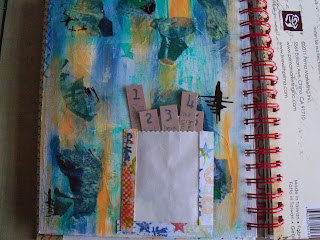


The 5 things I love page is one of Kate's pages, adapted.  I don't have 5 secrets!  So these 5 tags cover my favourite music, food etc.   I made the washi tape ages ago, but the colours seemed to match.


Also using Kate's painting technique, I painted up one of the gesso'd pages, in Orchid, Autumn Fire, and Pea Coat, and used a comb through it when nearly dry.  Like this effect...


I completed a couple of pages using a couple of ideas from the Finnabair workshop a month or so back.  One piling up the embellishments and then painting over (with the same Paper Artsy paints).  The other using Kate's painting technique, Orchid again, with black calligraphy ink - she's right, it doesn't jump out, it's just 'there'.  The Finn bit is the three strips of paper, and the tinting of the photos.


Then a week or so later, Linda's session down at Menheniot.  I got an exclamation along the lines of: 'Ruth, this isn't like you, it's so clean!'.  Hmm.  I can flex my style!!  OK, so I had some nice papers I wanted to use...


The basis of this book is what I used to know as Deed Envelopes, back in the day.  They used to hold the Epitome of Title - the lord only know what they get used for now, with registered land!!  Anyway, a bunch of these envelopes, glued together correctly (manic laughter off - I struggled with the 'correctly' bit!) and then painted up, or, in my case, covered with some nice papers.  This gives you a nice pouch for 4" x 6" matts - and a further hidden pouch, under the flap, which will also take a 4x6.


Yes it is nice and neat - so far, but there is still plenty of inking and stuff that can be done to mess it up! 


The photos you can see here are of Eden, a place I love - quite appropriate, as it's just down the road from Menheniot.  The colours in the Thai silk pennants are 'my colours' and I think that their brightness contrasts nicely with the muted tones in the two paper stacks I used (DCWV Mariposa, and Cloud 9 Hannah's Story).   And butterflies are ALWAYS good.

So I will go through my photos of my two trips to Eden and fill this little photo book up, with a few extras of St Michael's mount and St Ives.  Seems only right for a Cornish book!

Hope you like!

Saturday 26 October 2013

L is for...Craft Barn Challenge

Bit late this time, but here is my entry for the Alphabet challenge.

This week's letter was L, and I had to include a window.  Went for something fairly straight forward, which is Landscape - which seemed appropriate for a pair of French doors!


Having cut the card to allow for the 'doors', I masked off the windows, and then, out with the trusty brayer.  I created the hillocks with various shades of Adirondack, and some torn paper.

the sky was done in the same way, with the sun, distress ink mixed with cosmic shimmers (of course!!)

All the stamps are Clarity - the trees are all brilliant!

Hope you like!

Resources

Paint and ink
Adirondack: Juniper, Lake Mist, Lettuce, Stonewashed
Big and Juicy: Waterfall
Distress ink: Mustard Seed
Archival (Wendy Vecchi): Potting Shed, Fern Green

Stamps
Clarity:  trees, 3 different ones!

Bling and other stuff
Cosmic Shimmer: Pearl mist