I have recently been on two different book related away days, one with
Kate Crane (Junk Journal at the Stamp Attic in Wantage), the other with Linda Knight (
Just scrapbooking, Envelope journal at the lovely
Roseland Mews in Menheniot).
Neither of them are finished, as this will take some time, but I think that there is enough done to show off the general ideas!
So Kate Crane first. Wow. We were given a list of junk to bring along - cereal packets and the like! Not the usual kit list to be sure...
We started off by cutting all our pages to size, and gessoing some. The front cover (the heaviest weight card) had Kate's paint treatment, which was such fun. I used colours that complemented the papers I had brought along to use - Pea Coat (my favourite!) and Hey Pesto. To accent, a really bright pink (not sure what make) and good old black.
The spine is sticky back canvas, painted black, with polka dots in my colours.

I brought along some papers I have had for ages, and wanted to use DCWV, Vintage Blue - there was a nice range of designs and colours, and some matching chipboards.

Kate also gave us some prints of some Gelli prints she had done, which you will see on my sister's skirt and wings, also on the house on the front cover. (She didn't know she had wings...!) If you're thinking 'why is there a white stripe across that page', there isn't, it's the gap between two half pages. Not quite sure what I am going to put on the page behind yet. But that is the point of a journal.
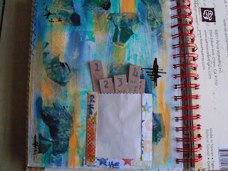
The 5 things I love page is one of Kate's pages, adapted. I don't have 5 secrets! So these 5 tags cover my favourite music, food etc. I made the washi tape ages ago, but the colours seemed to match.

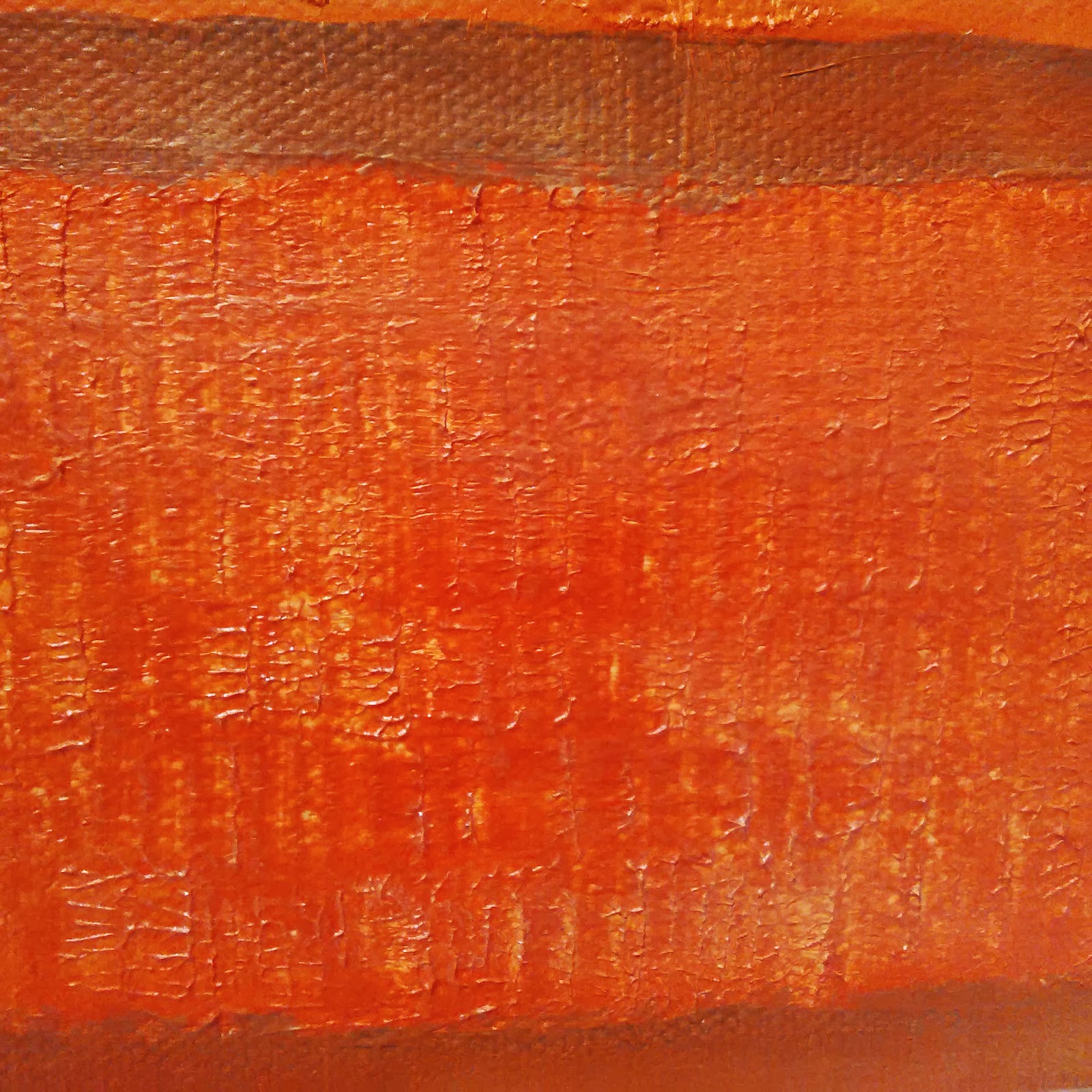
Also using Kate's painting technique, I painted up one of the gesso'd pages, in Orchid, Autumn Fire, and Pea Coat, and used a comb through it when nearly dry. Like this effect...


I completed a couple of pages using a couple of ideas from the Finnabair workshop a month or so back. One piling up the embellishments and then painting over (with the same Paper Artsy paints). The other using Kate's painting technique, Orchid again, with black calligraphy ink - she's right, it doesn't jump out, it's just 'there'. The Finn bit is the three strips of paper, and the tinting of the photos.
Then a week or so later, Linda's session down at Menheniot. I got an exclamation along the lines of: 'Ruth, this isn't like you, it's so clean!'. Hmm. I can flex my style!! OK, so I had some nice papers I wanted to use...


The basis of this book is what I used to know as Deed Envelopes, back in the day. They used to hold the Epitome of Title - the lord only know what they get used for now, with registered land!! Anyway, a bunch of these envelopes, glued together correctly (manic laughter off - I struggled with the 'correctly' bit!) and then painted up, or, in my case, covered with some nice papers. This gives you a nice pouch for 4" x 6" matts - and a further hidden pouch, under the flap, which will also take a 4x6.

Yes it is nice and neat - so far, but there is still plenty of inking and stuff that can be done to mess it up!

The photos you can see here are of Eden, a place I love - quite appropriate, as it's just down the road from Menheniot. The colours in the Thai silk pennants are 'my colours' and I think that their brightness contrasts nicely with the muted tones in the two paper stacks I used (DCWV Mariposa, and Cloud 9 Hannah's Story). And butterflies are ALWAYS good.
So I will go through my photos of my two trips to Eden and fill this little photo book up, with a few extras of St Michael's mount and St Ives. Seems only right for a Cornish book!
Hope you like!


 I started with the same Centura Pearl square as usual, and painted it up with Stewart Gill paints.