Showing posts with label Stampers Anonymous. Show all posts

Monday, 26 May 2014

Q&L - Music - Tiny Dancer

Hi all.  Time for the fortnightly quotes and lyrics challenge from the Craft Barn again.  This time it is Passion and Music - oh yes.  So, sticking to my 'I must have seen them live' criteria, I went for Tiny Dancer, by Elton John.  I think Madman Across the Water was the first album of his I bought, and I remember dancing round my bedroom to Tiny Dancer (and Indian Sunset... what a song, what an EPIC song...), I dreamt of marrying a music man...  That went well - NOT!  Anyway...

Blue Jean baby, LA Lady, seamstress for the band
Pretty eyed, Pirate smile, you'll marry a music man
Ballerina, you must have seen her dancing in the sand
 
Hold me closer Tiny Dancer
Count the headlights on the highway...


The Madman cover is embroidered denim, so I wanted to start with blue.  As I have been on a Kate Crane weekend (another one, at The Stamp Attic), and Kate does love a good colour wheel, I went with green. It had to be Dylusions!  I added a little Radiant Rain, for bling.
 
Dylusions reacts with water, so I used a mask or two and dabbed through it, with water, and with distress inks - that was a good effect!
Picking up on the seamstress idea, I used his Holtzness' blueprint stamps top and bottom, and reverted to handwriting (I must restart the calligraphy classes) the lyric.
 
Finally I added a couple of embellishments, a dress form, and some rain drops to act as headlights.  I love the way the glue soaks up the dylusions.
 
All in all, I'm pleased with it, so I hope you like!
 
 
Resources
 
Paint and Ink
Dylusions: White linen, After Midnight, London Blue, Polished Jade, Black Marble
Radiant Rain: Pearl Blue
Distress Ink: Black Soot, Stormy Sky
Archival Ink: Jet Black
 
Stamps
Stampers Anonymous: Mini Blueprints CMS150
 
Bling and other stuff
Tando Creative Mask: Music
That Special Touch Mask: Piano Keys
Studio 490/Blossom Bucket: Mannequin
Prima: Raindrops
Robins Nest Dewdrops: Fairy dust
Crafty Notions: Stellar Flash

Sunday, 27 April 2014

Random Birthday Card

These days, I hardly ever make cards, there's always other things to do.  However, when it is a special birthday, for a special person, I do want to make the effort.  A certain someone is 60 this week - which just feels wrong on so many levels - I am clearly closing in on the same age too (a few years to go, but even so...).


I knew it couldn't be uber-blingy, and I knew it had to go through the post.  I wanted to make reference to the passing of the years...and all this led to a Kraft base card, with a little dry embossing and some mega flake.


I am a great believer that the birthday starts with the envelope, so that has a little stamping too, on the back, an aide memoire for how to open an envelope, and on the front, just a little advertisement that there's a birthday coming up.

Hope you like!  (Actually, hope he likes too!)


Resources

Substrate
American Crafts Kraft Card

Paint and ink
Distress Ink: Stormy sky, Tumbled glass, Walnut stain, Tea dye
Archival Ink: Potting soil, Manganese blue

Stamps
Stampers Anonymous Tim Holtz Collection: Mini Blueprints CMS 154
IndigoBlu: Wild Meadow WM1, Happy Birthday HB
VildaStamps: Time Flies V474

Bling and other stuff
Mega flake: Gin and Tonic
Flitter Glue
Triboss embossing folder: watches
Sakura Gelly roll pen: clear star

May - Kathryn Wheel Calendar Challenge

In an effort NOT to be late for the Kathryn Wheel challenge for May, here we go!!


 This one really is bling city...  The month and year are die cut, and then glued on.  Then, I started off with a wash of purple and then overpainted with some Byzantium (full of mica) and a bit of Alchemy (iridescent loveliness...).  When dry, I stamped some dots, some scripts and the ticket label outlines.


I die cut the tickets, distressing the edges of the weekdays, and stamping the weekends with the same ticket label as in the background, adding the numbers in blingy Brilliance ink.  The final touch was to add a group photo (happy boating men!) from Deviant Scrap (thanks for the link, Kate!!)

All glued down with redline tape!

Hope you like!

Resources

Paint and ink
Rico: purple
Stewart Gill Byzantium: Cerisanctum
Stewart Gill Alchemy: White Mist
Brilliance: Pearlescent Lavender, Galaxy Gold
Distress Ink: Seedless Preserves
Archival Ink: Deep Purple, Hydrangea

Stamps
Wendy Vecchi Studio 490: All About Art LCS011
Stampers Anonymous: Apothecary CMS138
ClarityStamp: Numbers set

Dies
Sizzix Alterations strip die: Ticket strip 656620, Inside Out 657827

Bling and other stuff
Cosmic shimmer dries clear

Sunday, 6 April 2014

Q&L- Change - New England

The challenge from the Craft Barn crew this time was Truth and/or Change. I opted for change, as this songs takes me back to my school days.  Actually, it can't, as it was only released in 1983 (or 1984 if you go for the Kirsty McColl version) - I must have been imaging it my school days.  I was long gone by 1983! My song is 'New England' by Billy Bragg.
I don't want to change the world,
I'm not looking for New England,
I'm just looking for another girl

I love the end where he sings: 
Is it wrong to wish on space hardware, I wish, I wish, I wish you'd care
so I added that last line into the page.


  My school days were spent in Somerset.  With 20/20 hindsight, it was always sunny, the land was always lush, flowers bloomed permanently, never a care in the world.  I guess that may be why I keep returning to fairly verdant landscapes.  And watercolours.  May have to do some proper watercolour classes, before long, I guess. 
 
For this one, I used (for the first time) my inktense blocks, finely grated onto damp watercolour paper.  I used a very wet brush to create my fields and sky, and dabbed some of this off to create depth, and added more, by stamping hedgerow type foliage when it was dry, at the front, in archival ink.
 
I also stamped some butterflies, again because of the change reference, but also because I remember our garden being full of butterflies.
 
I am still struggling with white.  This time I opted for some liquitex acrylic ink, with a fine paintbrush.  It's still not as white as I would like, but at least it is there.  The others just soaked into the watercolour paper.  I did most of my colouring in with Pitt pens (india ink) - I like that you can see the archival through it, and it was still the colour on top of the inktense.
 
So thanks, Billy, for taking me back to an unreal world - I am happy with the memories that are created, so I don't want to change the world I have created in my head!

And....still managing to only use songs from people I have seen live!
 
Hope you like
 
 
Reosurces
 
Substrate Windsor and Newton Cotman Watercolour Paper
 
 
Paint and Ink
Derwent Inktense: various colours
Archival Inks: Fern Green, Sap Green, Jet Black, Hydrangea, Deep Purple, Leaf Green, Dandelion
Faber Pitt Pens
Liquitex Acrylic Ink: Titanium White
 
Stamps
PaperArtsy: HP1203EZ Botanical, HP1009 Happiness, HP1010 Poetry, HP1005 Take Flight
Stampers Anonymous Tim Holtz Spring Sprung CMS084
Stampin' Up: Broadsheet Alphabet
 
Bling and other stuff
Sakura Gelly roll pen

Sunday, 9 February 2014

Q&L - Miss

Hi there!  This fortnight's Quotes and Lyrics from the Craft Barn challenge is 'Miss'.  I have loved Elton John's music for ever, and one of his earliest hits just came rushing at me for this:


and of course, it gave me a change to go mad on the bling front!

This year, my book is A3, so I do have masses of space to go large.  I used as my base the shiny side of centura pearl, and painted it with water, before spraying it with several colours of Dylusions.

I cut a circle out for my earth, using the hole as a stencil to rub some iridescent blue luminarte powder through, extending it slightly larger, to give my 'earth' a corona.  The earth was painted up with fresco finish paints, and then sprayed with goosebumps, to make it a bit bobbly.

I stamped that lovely Tim Holtz lady in archival, and then smooshed her through some watered down distress ink, doing the same sort of thing for the words, only in this case, the DI was watered down with cosmic shimmers.


It's hard to believe that this single was released in 1972 - OMG...

Hope you like!


Resources

Paint and ink
Archival ink: Cobalt, Cornflower Blue
Distress Ink: Dusty Concord, Stormy Sky
Dylusions: London Blue, Vibrant Turquoise, Black Marble, After Midnight
PaperArtsy Fresco Finish: Pea Coat, Toad Hall, Hyde Park, Nougat

Stamps
Stampers Anonymous, Tim Holtz: Classics no 5 SCF005

Bling and other stuff
Goosebumps
Luminarte: Iridescent blue
Cosmic Shimmer Mist: Pearl, Astral Mystery

Saturday, 4 January 2014

Monthly Calendar - January

I went on one of Kate Crane's weekends last year, at the Stamp Attic, and really enjoyed it, so I have decided to have a go at doing Kate's Calendar Challenge this year - details are on her blog, The Kathryn Wheel.  I am going to start off slow and steady, so I don't burn out too early!  I am rubbish at diaries and the like, and have trouble doing anything regular, like even keeping my accounts up to date... oh dear.


I found this lovely book in Paperchase.  The paper quality is just fantastic, and I like the craft (or Kraft) covers, which I will decorate at some point.  The pages are c 9 1/2 inches square, or 24 cm.  Slightly cream or ivory.  But , oh so thick!


I decided January had to be green - my garden is sooooo lush - I don't mean that in a bristolian sense, more a verdant sense!  All the rain, already!  So the main part of the background is dylusions sprays, in cut grass, fresh lime and then some pure sunshine (I wish).  It wasn't quite what I was after, so I added a little white linen, which provides a little mistiness in the background.

Then out with the stencils, I love the Tando harlequin trellis, it's great.  Then Tim's Bubbles, with Picket Fence distress stain.  And an umbrella or three from the lovely Mr Skinner - very appropriate!

Then I stamped my hedgerow in - cow parsley, I think. First and second generation in two colours of Archival ink.  I also stamped the small bird from the same set on a separate piece of card, and attached it top right.

Elsewhere on this blog, I mentioned that I discovered pearlescent acrylic ink - still loving it!  Probably could have done with the Jan being a little more black, but I still like it.  There's a little doodling in black micron pens, a tippex pen, and a glittery sakura pen.

Then I drew my grid for the calendar entries.

Right, first (and only!) resolution of the year - do this every month!

Hope you like!


Resources

Paint and Ink
Dylusions: White Linen, Pure Sunshine, Fresh Lime, Cut Grass
Archival: Monarch Orange, Sepia
Distress Ink: Mowed Lawn
Distress Stain: Picket Fence
Daler Rowney FW Pearlescent Ink: Black

Stamps and Masks
Stampers Anonymous, Tim Holtz - Nature's Moments CMS001, Bubbles THS002
Tando Creative: Harlequin
Andy Skinner for Tando Creative: Accessories

Bling and other stuff
Tipp-ex pen
Micron pens
Sakura Gelly Roll pen, glittery pink

Sunday, 29 September 2013

J is for...Craft Barn Challenge

In my world, J is for the green-eyed god: Jealousy, Jade and Jewels. 


I got out my melt pot, and made some jewels with various colours of UTEE.  I think I made a fairly muddy fire opal, a piece of dark jade and maybe a ruby or a garnet...  I did discover that a tiny pot of Cosmic Shimmer embossing powder with glitter in it is GORGEOUS, and I wish I had a bigger pot!

I reverted to my standard card, Centura Pearl and stamped two eyes, not a pair!  They have been coloured with watercolour pencils, making the eyes really green. 

The background was done with wax watercolour crayons, and a waterbrush.

When the Jewels were cool, I glued them to the background, and created my tag in the usual way, and glued on the definitions.  The ribbon or yarn is a fantastic yarn I bought back along, and is not yet calling to me with any particular pattern!

Hope you like!

Resources

Ink and Paint
Archival Ink: Watering Can
Pentel Arts Aquash wax crayons
Faber Castell Colour Grip watercolour pencils

Stamps
Stampers Anonymous: Classics #5 SCF005

Bling and other stuff
UTEE - Mixture of Cosmic Shimmer and Ranger Clear
Crafty Notions Jewel Tones: Ruby Red
Cosmic Shimmers: Lapis Black Aurora, Bright Gold, Silver Shine, Tropic Pearl, Steel Blue Aurora
Best Flexible Molds: Caboshapes1 (PJ038)
Karantha mold: Square Pyramid, Cabochon

Monday, 26 August 2013

O is for... Craft Barn Challenge

It seems like ages since I have posted anything, and that's because....I can't tell you!! Suffice it say, all will be revealed, in time!  (Now that was a cracking musical!!  Cliff Richard - Excellent!)


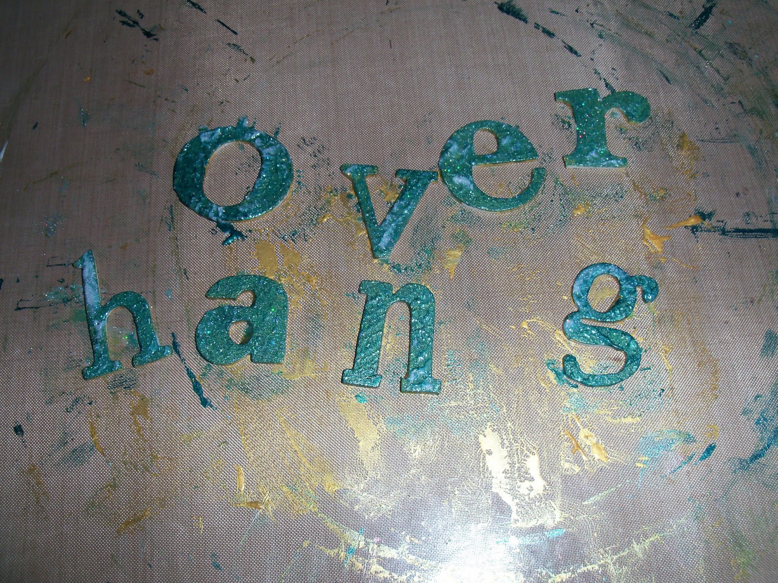
Anyway, this fortnight's challenge from the Craft Barn was O.  O in my world is for Overhang, Opening, and Ovum (well Ova, really, as there are 4 of them).  There's also a bit of Orange in there, and for any fans of The Two Ronnies: Well, 'Got any 'ose?'  Yes, Os!  I managed to use my two new toys on this...


As usual I started with Centura Pearl as my base. I measured and scored it, then swooshed the inside with Distress stains.  I did a bit of dripping technique, and also flicked water on it, and dabbed it off. 


The Os are die cut  (using my lovely new Big Shot Pro!!!!  Woo hoo!!) again from Centura Pearl, as it does stand up to being ill-treated!  I used them as a stencil to spray black Dylusions through, and then turned them over and painted the glossy side with Tarnished Brass stain, and then sprayed Twilight Black cosmic shimmers over. Love the effect - like gunmetal.


I cut the 'window' out twice from Centura Pearl again, and used the same sorts of colours on the side facing.  When it was (nearly!) dry, I pierced holes for my brads to go through, and then glued the facing side to the inside  - to cover the brads.  Inside, I glued my 4 ova, and stuck the aperture down.


On the front flap, more distress stain, and a couple of dribbles of cosmic shimmers.


I die cut  (Big Shot Pro again!!) the letters from skinny funky foam - it's probably a bit too skinny, but hey!  Then, out comes the other new toy...  Linda Knight introduced me to Stewart Gill Paints.  I bought more, O. M. G.  Wow.  And again WOW!!  I painted the letters in Byzantia Laurelius, which is a jewel tone on its own, but then I added Galactica over the top.  This is like holographic glitter suspended in paint, and is just gorgeous.  Wait till you see what else it does (oops - you'll have to wait for that!)

As usual, the definitions cut from my Mum's old Collins Dictionary have been glued to a tag, with Orange ribbon, and another O.

Hope you like!


Added extra:  I realised (OK I was told!!) that the definitions didn't show up.  So one more photo, to show them on the tag, which was tucked in behind the main page.  Sorry!


Resources

Ink and Paint
Distress stain: Wild Honey, Mustard Seed, Shaded Lilac, Dried Marigold, Tarnished Brass
Stewart Gill Byzantia: Laurelius
Stewart Gill Galactica:  Holo Silver
Versafine: Majestic Blue
Dylusions: Marble Black

Dies and Stamps
QuicKutz: Pop-up door (REV-02320S)
Sizzix (Tim Holtz Alterations): Wordplay (657837), Washer Border (657826)
7 Gypsies: Conservatory (17907)

Bling and other stuff
Cosmic Shimmer: Twilight Black
Prima: Brads
Ribbon from stash

Monday, 1 July 2013

And I heard Mr Young sing about her... Hels Sunday Stamper Challenge

Sweet home Alabama
Where the skies are so blue
Sweet Home Alabama
Lord, I'm coming home to you

Oh yes, it's in  my head now, Hels!!  I love this song, and the sentiment.  So Hels set us the challenge of Home.

I adore these Darkroom Door stamps, and the sentiment is so good too.  It also fits quite well with a Crowded House song I'd much rather live in a caravan in the hills, than a mansion in the slums - another one of my favourite bands...

Anyway, enough.   I started with a Kraft tag, which I swooshed through distress stains, including Tarnished Bronze.

I stamped the cowslips in three different colours, then added my favourite Tim birds.

I stamped one of the Darkroom Door cabins, and ripped up the edges, using some of the techniques in Tim's June tag (just haven't got to THAT this month...) and the same sort of thing for the sentiment.

The ribbon had the same sort of treatment with the Distress stains, but had to add a touch of Cosmic Shimmer Bronze blush, a) for the bling and b) to tie it all together.


Resources

Ink and Paint
Archival Ink: Jet Black, Monarch Orange, Venetian Orange
Distress Stain: Wild Honey, Mustard Seed, Tarnished Bronze
Distress Markers: Wild Honey, Mustard Seed, Brushed Corduroy, Vintage Photo, Pumice Stone

Stamps
Darkroom Door: Home Sweet Home DDRS041
Stampers Anonymous: Nature's Moments CMS001, Mini Ornates 064

Bling and other stuff
Cosmic Shimmer Mist: Bronze Blush

B is for...Craft Barn Challenge

Well, I think it's fair to say, I have been waiting for this one!  I LOVE butterflies.  And I do keep going back to the same butterfly stamps (I wonder how many times these same stamps get used on other people's pages?).

I do like to have a couple of words included in my challenge, and this one is no different - Blue and Butterfly, with a side order of Bling...


I have some glossy card stock in my stash, picked up at a show somewhen.  This is the real deal when using alcohol inks, and I don't use THOSE enough!

So that is my base, three shades of blue with pearl mixative.  Then stamped those gorgeous stamps from the Papillon collection in cobalt archival.


On some shrink plastic (and yes, I have done this before!), I stamped the HUMUNGOUS Swallowtail from Stampin' Up.  (Note to self, remember, next time, STAZON not ARCHIVAL! Got it all over my fingers, the tweezers and the mat when I tried to use my watercolour pencils on it - whoops!)  Of course, it heat sets when you shrink it, but then it isn't so easy to colour...  you can if you squint a bit make out there's some BLUE and BURGUNDY on the wings - OK, squint quite a lot...


I had some lovely blue ribbons - one is a 'found ribbon' (think it might have been from a box of chocolates - can you imagine - a box of chocolates in THIS house...)  and the other is from American Crafts.  They complement the alcohol inks quite well, I think.

Have you noticed how much longer everything takes to dry in this heat?  Except for the cosmic shimmers glue, which seems to set in the spout before I have even squeezed the bottle!

Enjoy!

Resources

Paint and Ink
Adirondack Alcohol inks: Cloudy Blue, Denim, Stream, Pearl Mixative
Archival: Cobalt
Distress stain: Chipped Sapphire

Stamps
Stampers Anonymous: Papillon CMS 106
Stampin' Up: Swallowtail

Bling and other stuff
Mirror stick ons
Shrink plastic
Ribbons

Sunday, 16 June 2013

My Guy - Hels' Sunday Stamper Challenge

Hels Challenge this week was one for Father's Day, My Guy. 

My big thing this week was to use one of the canvas boards I found on ebay, and see if they might be a good substrate for the kinds of effects that we did on the Just Scrapbooking retreats.  I think they will be great, and I have spotted that there are 12 x 12s on his website...mmmm, I can feel a purchase coming on!  Anyway, sort of followed Hels' guide this week, except on canvas board.


Painted it up with cream and brown acrylic paint, then stamped liberally with three different background stamps: script, cogs, and the french advert.  Remembered to dry in between each layer this time...


Moved on to the back side of Centura Pearl to do my stamping.  Had a few goes as the middle of the stamp did NOT want to play.  This is where Indigo Blu's slim jims come to the fore.  Finally got it to stamp properly, so dried it, and then used a waterbrush and distress inks to colour in.  Distressed the edges, and twisted two colours of bakers twine together, adding the Wish token.


I'm not sure where I saw this (might have been Helen's layout at Hatton Court last week), but somewhere I saw UTEE used as a glue, and thought it would work on this, especially as the canvas board is so lovely and robust. I melted some plain clear UTEE and poured it over where I had place the three flat cogs.  I then used my heat gun to soften it back up a little and added the real cog and spring and the two spiral wires.


I went around the edge with a gold paint dabber to close it off.


Whilst the boards are clearly sturdy, a cropodile can still go through them!  Wire and baker's twine twisted together to create the hanging.

Yup, I can thoroughly recommend these boards!


Resources

Substrates
Canvas Discount boards 15cm x 15cm
Centura Pearl

Paint and Ink
PaperArtsy: Nougat
DecoArt Traditions: Quinacridrone Gold
Adirondack Paint Dabber: Gold
Distress Ink: Vintage Photo, Bundled Sage, Frayed Burlap, Antique Linen
Versafine: Vintage Sepia

Stamps
PaperArtsy: Gentleman Plate 1, Cogs (mini), Old Text (mini)
Stampers Anonymous: Papillion CMS106

Bling and glitz
Ranger UTTE: clear
From Stash: Wire, Bakers twine, eyelets, cogs, and medal