Monday 26 August 2013

O is for... Craft Barn Challenge

It seems like ages since I have posted anything, and that's because....I can't tell you!! Suffice it say, all will be revealed, in time!  (Now that was a cracking musical!!  Cliff Richard - Excellent!)


Anyway, this fortnight's challenge from the Craft Barn was O.  O in my world is for Overhang, Opening, and Ovum (well Ova, really, as there are 4 of them).  There's also a bit of Orange in there, and for any fans of The Two Ronnies: Well, 'Got any 'ose?'  Yes, Os!  I managed to use my two new toys on this...


As usual I started with Centura Pearl as my base. I measured and scored it, then swooshed the inside with Distress stains.  I did a bit of dripping technique, and also flicked water on it, and dabbed it off. 


The Os are die cut  (using my lovely new Big Shot Pro!!!!  Woo hoo!!) again from Centura Pearl, as it does stand up to being ill-treated!  I used them as a stencil to spray black Dylusions through, and then turned them over and painted the glossy side with Tarnished Brass stain, and then sprayed Twilight Black cosmic shimmers over. Love the effect - like gunmetal.


I cut the 'window' out twice from Centura Pearl again, and used the same sorts of colours on the side facing.  When it was (nearly!) dry, I pierced holes for my brads to go through, and then glued the facing side to the inside  - to cover the brads.  Inside, I glued my 4 ova, and stuck the aperture down.


On the front flap, more distress stain, and a couple of dribbles of cosmic shimmers.


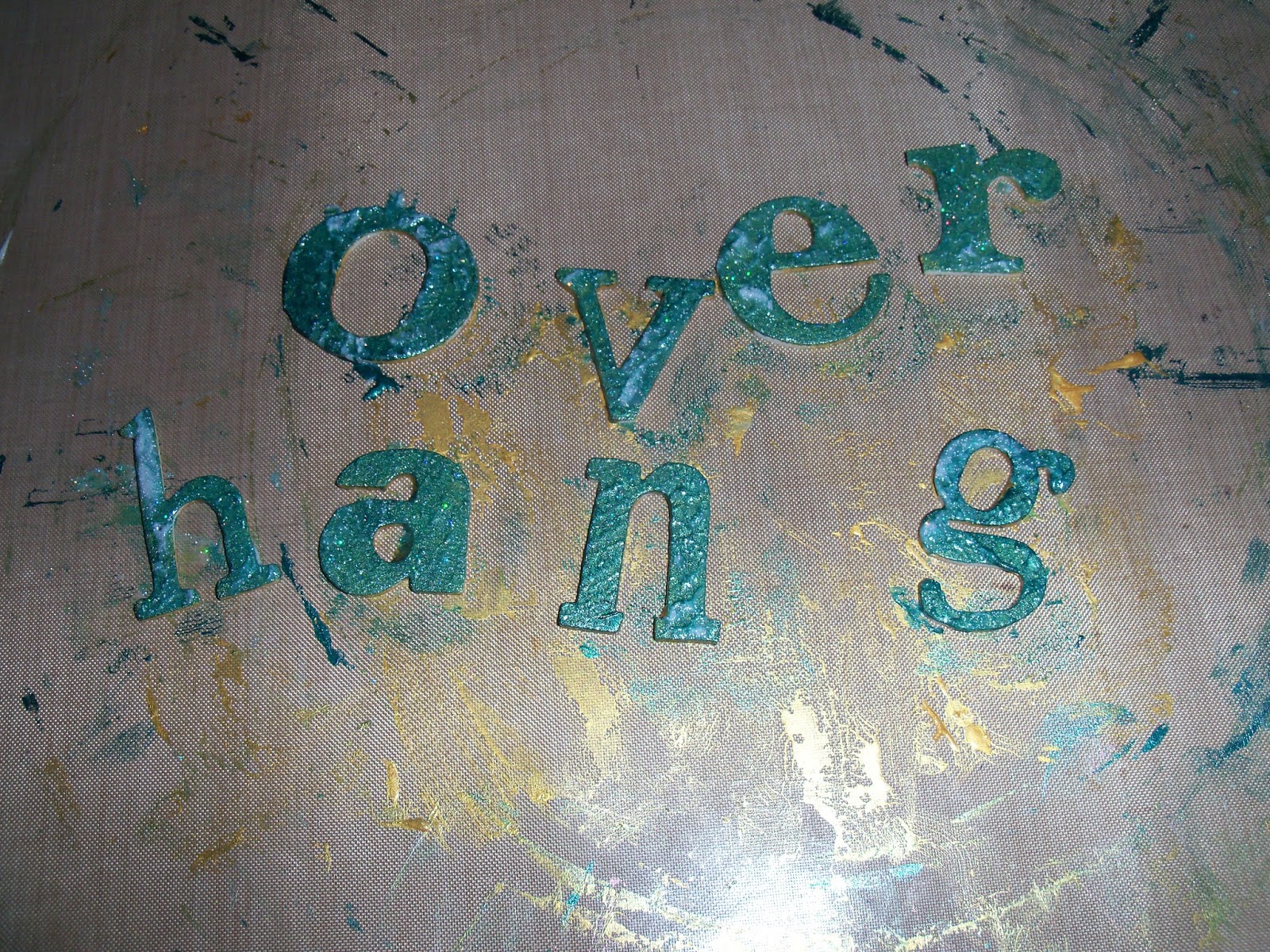
I die cut  (Big Shot Pro again!!) the letters from skinny funky foam - it's probably a bit too skinny, but hey!  Then, out comes the other new toy...  Linda Knight introduced me to Stewart Gill Paints.  I bought more, O. M. G.  Wow.  And again WOW!!  I painted the letters in Byzantia Laurelius, which is a jewel tone on its own, but then I added Galactica over the top.  This is like holographic glitter suspended in paint, and is just gorgeous.  Wait till you see what else it does (oops - you'll have to wait for that!)

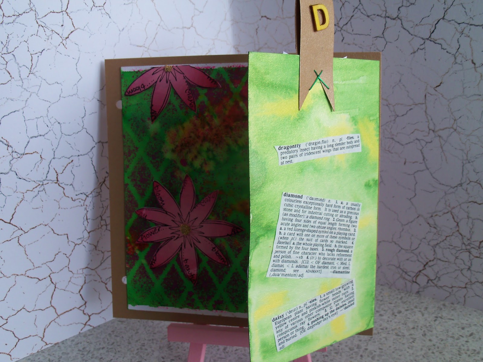
As usual, the definitions cut from my Mum's old Collins Dictionary have been glued to a tag, with Orange ribbon, and another O.

Hope you like!


Added extra:  I realised (OK I was told!!) that the definitions didn't show up.  So one more photo, to show them on the tag, which was tucked in behind the main page.  Sorry!


Resources

Ink and Paint
Distress stain: Wild Honey, Mustard Seed, Shaded Lilac, Dried Marigold, Tarnished Brass
Stewart Gill Byzantia: Laurelius
Stewart Gill Galactica:  Holo Silver
Versafine: Majestic Blue
Dylusions: Marble Black

Dies and Stamps
QuicKutz: Pop-up door (REV-02320S)
Sizzix (Tim Holtz Alterations): Wordplay (657837), Washer Border (657826)
7 Gypsies: Conservatory (17907)

Bling and other stuff
Cosmic Shimmer: Twilight Black
Prima: Brads
Ribbon from stash

Thursday 15 August 2013

The Queen and her Crown - EWV challenge

I made this card at the weekend, but it has had to wait to be published until after the recipient had her birthday!


There used to be a range of stationery here in the UK that said something along the lines of 'I am the queen of everything' - ahem, I don't want to offend anyone, but there is a strategic expletive omitted!  Well, this was extremely apt for my chum, and it has always stuck with me.  So I decided on a stamp set from Wendy Vecchi which has a lovely gurlie silhouette (which also is reminiscent of my regal mate), and a good phrase.


I put my hand in the cupboard that had all the card blanks, and the one I pulled out had a glossy finish, so it had to be alcohol inks for the background.

I die cut a scalloped oval and an oval.  I stamped the queen on my oval, and then heat embossed her, so I could swoosh distress inks in the background.


I stamped the sentiment, and swooshed the same distress inks over it, and then cut them out and mounted them on foam squares. I added stickles to the word 'crown' to make it jump out a bit.


The crown.  Well, I had a brad in the shape of a crown, but it was brassy antique colour.  I sanded it down, and dripped silver and purple alcohol inks on it.  Then I cut the legs off, and stuck it on Queenie's head.  To finish it off, I added some bling, and some ribbon!

Hope you like it, but more to the point I hope SHE (who must be obeyed!) liked it too!


Resources

Substrates - random glossy 6 x 6 card, Centura Pearl (for die cut oval)

Paint and Inks
Adirondack Alcohol inks: Purple Twilight, Shell Pink, Cool Peri, Silver, Pearl
Adirondack: Purple Twilight
Distress Ink: Victorian Velvet, Milled Lavender

Stamps
Studio 490: Regal Art (SCS058)

Bling and other stuff
From stash: ribbon, holographic card, Crown brad
Stickles: Star Dust
Stampendous embossing powder: Detail Clear
Spellbinders Grand Nestabilities: Grand Scalloped Ovals (LF-111) Grand Ovals (LF-110)
Stampin' Up: Sticky rhinestones

Sunday 11 August 2013

Water water everywhere, and n'er a drop to drink!

Have I mentioned, I love Linda Knight??  Her workshops are just so relaxed.  It's not about replicating something of hers (as if!), it's all about the techniques.  This session was about water colouring - not the old master style, but how to use wet pigments to create amazing backgrounds.  There was a lot of water used for these.

I took along my brusho pigments, which I bought last year sometime.  I got a bit scared about using them....but not any more!!    Brushos are pure pigment in granular form, they come in little plastic pots, and you add water. I'm now thinking about adding them to white acrylic...hmm...

Our substrate was an A1 sheet of watercolour paper, ripped into three.  Most of the group bound them into books, but I haven't done this yet.  I worked on each of them as a land(or water)scape, so when I tried to fold them into the chapter for my book, the landscape got lost.  I want to create a few more pages, and perhaps bind it differently, so these pages will sit on the side for a while, while I cogitate on this further!

While I was working, one of the lovely ladies on the session suggested that I drop a tiny pinch of the granulated pigment into the wet background.  OMG!  As you can tell, I LOVED the effect this gave.

Then Linda showed us how to stamp with bleach (another one of those things I was scared to do - why???  Easy, and what great effects.  So, here are the outputs!

The first photos are of the sea page.  The wavy lines are a stamp - in bleach.  the speckles are the dry brusho sprinkled on the west background.


Now, this one...

It looked like a really stormy sky...so I dripped bleach through a pipette down the page, to get lightening!  It needs a tree at the bottom I think.


I knew as soon as I stamped the flower border at the bottom of this page, that it was going to be butterflies!


 Dragonflies, oh yes!  Several stamped in bleach, and a couple them over-stamped with pigments - I think this was inktense.

I put a dollop of mica powder into bubblegum dylusions, and painted it on for some dimension... you can just make it out, shimmering!


In real life, this one is lovely...but I'm not quite sure what it is yet!!


 This one is going to be dandelion heads I think.  You can see where I stamped a flower in bleach and in ink top left, if you squint a bit!!!


 This is all the leftovers from my palette!  with a couple of drops of drawing ink.  This is rigid with mica, and where I stamped my Dragonfly for the Craftbarn challenge  (different dragon fly - I need to get that big one from Linda!!  It is gorgeous and HUGE!!)

Hope you like!

D is for...Craft Barn Challenge

Hi all!  Here is my page for the current Craft Barn Challenge - D.  In my world, D is for:  Daisy, Diamond and Dragonfly!


Elsewhere on here you will see that I spent yesterday with Linda Knight (Just Scrapbooking) , who finally showed me a really cool way of using my Brusho watercolours.  So when I got home last night, I knew what I wanted the background to be!  Because you have to basically soak the paper to allow the colours to wick together, and Linda said it doesn't work as well if you help it along with a heat tool, I did the background bit last night, and the rest of it today.  the card needs to be masked down, to try and keep it flat.

So having got to the green background, with the orange colour wicking through it, I placed a Diamond (well harlequin to be precise, Diamond in my world) mask, and sprayed Dylusions Bubblegum pink over the top (and all over my hands!!). I set that aside to dry (there's a first!).

I got out my lovely fresco paints, and swooshed circles of blood orange and nougat on some scraps of card.  This dries really quickly (which is good), and then I stamped the daisies on in black archival.  I also stamped the dragonfly from the same set on to a piece of card that I brought home from the watercolours class.  This was made using up all the bits of colour left over.  It is almost RIGID with mica powders in real life - the camera just couldn't capture it.  I cut all the images out, and glued them on the trellis!  They weren't finished, so I added cosmic shimmer dries clear glue, and poured gold micro beads onto the glue.

I painted the flap (mainly because when I folded it over, I realised I had got green seeping on to it from the front).  So the colour I had left from last night, I dabbed on to the flap, and then stuck down my definitions.  I finished it off with the usual 'flag' tab, and the D, painted yellow.

Hope you like!


Resources

Substrate: Centura Pearl

Inks and Paints
Brusho Crystal Colours: Leaf Green, Gamboge
PaperArtsy Fresco Finish: Blood Orange, Nougat
Archival Ink: Jet Black
Dylusions: Bubblegum Pink

Stamps
PaperArtsy: Daisy and Dragonfly - JOFY13

Bling and other stuff
American Crafts Pop! Microbeads
Tando Creative Mask: Harlequin

Saturday 3 August 2013

T is for...Craft Barn Challenge

Well, it's that time again...and I nearly missed the Craft Barn deadline, again!  Anyway, T is for lots of things on this offering...like Teal, Tangerine, Time, Tangent, Trigonometry, Triangle - oh and Three (ribbons in the plait!!).

I did actually love Trig at school, and I must have had really good teachers for SOH, CAH and TOA to be going around in my head all (gulp 40...) these years later. 


I knew it was going to be Teal for the base, because I do so love Peacock Feathers Distress Stain.  I smooched it on, and then flicked water at it, and dried the drops off.  I used a lovely clock face mask with Picket Fence, which didn't go as obvious as it usually does, so I think I probably didn't dry the Peacock Feathers as much as I should.  So I used a black fine liner to do a spot of (wait for it..) zenTANGLE...(sorry.)

Then I used the same fineliner to draw my Tangent and Triangle (Pythagoras has so much to answer for!), and a broad nibbed pen to write my Trig equations.


Finally I dug the ribbons out (from previous purchases of Troll Beads, of course!) and plaited them, to use on my Tag. 
 
Quite simple this time.  Hope you like!


Resources
 
Ink and Paint
Distress Stain: Peacock Feathers, Picket Fence
 
Bling and other stuff
Tando Creative Mask: Clock
Calligraphy Pen
Fine Liner
Ribbons