Showing posts with label Stampin' Up. Show all posts

Sunday, 6 April 2014

Q&L- Change - New England

The challenge from the Craft Barn crew this time was Truth and/or Change. I opted for change, as this songs takes me back to my school days.  Actually, it can't, as it was only released in 1983 (or 1984 if you go for the Kirsty McColl version) - I must have been imaging it my school days.  I was long gone by 1983! My song is 'New England' by Billy Bragg.
I don't want to change the world,
I'm not looking for New England,
I'm just looking for another girl

I love the end where he sings: 
Is it wrong to wish on space hardware, I wish, I wish, I wish you'd care
so I added that last line into the page.


  My school days were spent in Somerset.  With 20/20 hindsight, it was always sunny, the land was always lush, flowers bloomed permanently, never a care in the world.  I guess that may be why I keep returning to fairly verdant landscapes.  And watercolours.  May have to do some proper watercolour classes, before long, I guess. 
 
For this one, I used (for the first time) my inktense blocks, finely grated onto damp watercolour paper.  I used a very wet brush to create my fields and sky, and dabbed some of this off to create depth, and added more, by stamping hedgerow type foliage when it was dry, at the front, in archival ink.
 
I also stamped some butterflies, again because of the change reference, but also because I remember our garden being full of butterflies.
 
I am still struggling with white.  This time I opted for some liquitex acrylic ink, with a fine paintbrush.  It's still not as white as I would like, but at least it is there.  The others just soaked into the watercolour paper.  I did most of my colouring in with Pitt pens (india ink) - I like that you can see the archival through it, and it was still the colour on top of the inktense.
 
So thanks, Billy, for taking me back to an unreal world - I am happy with the memories that are created, so I don't want to change the world I have created in my head!

And....still managing to only use songs from people I have seen live!
 
Hope you like
 
 
Reosurces
 
Substrate Windsor and Newton Cotman Watercolour Paper
 
 
Paint and Ink
Derwent Inktense: various colours
Archival Inks: Fern Green, Sap Green, Jet Black, Hydrangea, Deep Purple, Leaf Green, Dandelion
Faber Pitt Pens
Liquitex Acrylic Ink: Titanium White
 
Stamps
PaperArtsy: HP1203EZ Botanical, HP1009 Happiness, HP1010 Poetry, HP1005 Take Flight
Stampers Anonymous Tim Holtz Spring Sprung CMS084
Stampin' Up: Broadsheet Alphabet
 
Bling and other stuff
Sakura Gelly roll pen

Saturday, 25 January 2014

Squeeze - Q&L Challenge

The Craft Barn's challenge this year is around Quotes and Lyrics, and the first one is 'Smile' and/or 'Up'. 

One of my favourite bands is Squeeze - Difford and Tilbrook write the most amazing lyrics, and Up the Junction is brilliant, for so many reasons.  It's all in the present tense, but tells a story over several years.  And it is really poignant.  I used to live around the corner from Clapham, and I used to catch one of the old routemasters (the ones you could hop on the back of, you didn't have to wait for the doors to open).  I put all of this together, and came up with:


I found a fantastic artist's sketchbook, A3 size, so this is really going to give me space to play!  I watered the page, and smooshed on quite well watered brusho pigments.  They are still quite vibrant colours!

Then I did some stamping, using archival inks, and a little bit of stencilling - musical notes!


I stamped the words and the bus in Archival.  I added a little more watered down brusho to the bus, and then some white enamel accents - the old no 11 was this cream and red livery, back in the day.

I doodled around the edge of the words (this is the last line of the song), added a little shading underneath and, hey presto!

It is amazing how much difference that little bit of shadow makes - this is the page BEFORE shading.


On the facing page, when it has dried a little, I am going to write out the full lyric.  But it is still a little damp at the moment!!

Hope you like!

Resources

Paint and ink
Brusho pigments: Cobalt Blue, Prussian Blue, Black, Sea Green, Leaf Green
Archival Ink: Jet Black, Watering Can, Red Geranium, Sap Green, Fern Green, Manganese Blue
PaperArtsy: Nougat
Stampin' Up: Whisper White Pigment ink
Aquash watercolour crayons: Black

Stamps and Stencils
IndigoBlu: Square Peg Round Hole, Harlelquin
PaperArtsy: London Plate HP1208EZ
Artemio: capital letters
Hero Arts: Printers type lower case
Tando Creative: Music Mask

Bling and other stuff
Micron Fineliners
Sakura Gelly roll stardust pens
Enamel Accents: White

Sunday, 19 January 2014

Back to class... The Art Society - Soar

Hi there.  I don't really believe in New Year's resolutions, but I have been thinking that I would like to do more different things, learn more, try more, and most of all, use some of the stash!! 

I have always been interested in Christy Tomlinson's style, and when I saw she was doing an online class this year, I thought 'Aha, that's for me!'  So, along with Kate Crane's calendar challenge, and The Craft Barn Quote's and Lyrics challenge...hmm...we shall see, and a few classes with Kate and Andy Skinner, and I have to fit Just Scrapbooking in...Aaaargh!  But such fun...  I wonder, will I be able to fit work in?

It's not appropriate for me to do a step by step on this, but I will add a few photos.  It isn't a copy of Christy's but it is in the same style, but perhaps a little more blingy - of course!!


Just checking everything fits.


Painted book pages


Spellbinders dies cuts, sprayed, of course, with cosmic shimmers


Butterflies and peacock feathers!  Match made in heaven


Normally, pink would be my colour of choice, but...


...cream looked so much better!  Still needed some bling, tho
Just a touch of Alchemy on the butterflies, and on the letters...

Hope you like!

Resources

Substrate: Liquitex 10 x 8 canvas, book pages,  Stampin' Up papers: Springtime Vintage

Paint and Ink
DecoArt Traditions: Prussian Blue
PaperArtsy: Pea Coat, Nougat
Archival Ink: Cobalt
Stewart Gill Alchemy: White Opal

Stamps and Dies
Stampotique: Amy Wilson Alphabet
Spellbinders: Peacock Feathers S4-429

Bling and other stuff
That special touch Mask: Butterfly
DecoArt Americana: Decoupage Matte
Daler Rowney: Glaze Medium
Cosmic Shimmers: Pearl, Twilight black

Saturday, 16 November 2013

Q is for....Craft Barn Challenge

I was hoping that the dictionary would have the land of my birth in, but no, so I opted for something that sounds vaguely Harry Potter, and reverted to trigonometry!  Q is for QUINCUNX and QUADRANGLE this Craft Barn Challenge.


I started with the same Centura Pearl square as usual, and painted it up with Stewart Gill paints. 


I used a watermark pen and some detail black embossing powder to create the quincunx, and also to highlight the edges, being the quad.  I quite like the effect where the powder stuck to the still damp paint in places.


I stamped the flowers on the offcuts, and painted them up. I added a pearl when I stuck them down on the quad.


As usual the tag has the two definitions on, with the wooden letter and a ribbon, to match all my other pages.

Hope you like!


Resources

Ink and paint
Stewart Gill Byzantium: Cardinale
Stewart Gill Alchemy: White Hot
Archival ink: Jet Black

Stamps
Sheena Douglas A Little Bit Sketchy - Always Floral SS-SD-FLOR

Bling and other stuff
Stampin' up: Adhesive pearls
Stampendous Embossing Powder: Detail black
Versamark: watermark pen

Thursday, 24 October 2013

Glitter for little girls!

I made this for one of my colleagues at work, well, more specifically for her little girl.  We were talking about how girls do gravitate to pink after a while, and I felt the need to do something in pink!

So here is the door hanger I made for Rosie.

Back (or front?)


Front (or back)?


The background colours are mainly Distress Inks, and I used a stencil or two. 


I stamped and embossed the fairies and the word, and distressed the edges.  I added the foam letters, and then over painted with some lovely Galactica paint.  Have I mentioned I love this paint?  So much, I had to buy some other colours...  mmmmm.


On the other side of the hanger, I added loads and loads of flowers, which I had sprayed with cosmic shimmers, and some diamanté sparkles.  And another coat of the Galactica. Just in case there wasn't enough glittery stuff on it...

Hope you like, and more to the point, I hope Rosie likes...


Resources

Substrate: Stamps Away: Door hanger
IndigoBlu: Perfect Stamping card

Paint and Ink:
Distress Ink: Victorian Velvet, Worn Lipstick, Iced Spruce
Archival: Jet black
Stewart Gill: Galactica: Flamenco

Stamps and Masks
Lavinia: Fairies and words
Tim Holtz: stars
Dylusions: leaf flourish

Bling and other stuff
Stewart Gill Embossing power: Interference Red
Cosmic Shimmers: Pearl mist
Perfect Pearls spray: Interference Red
Prima Flowers: Essentials no 9
Stampin' Up: stick on gems
Papermania: Alphaminis

Thursday, 10 October 2013

Finnabair's Prima journal - birthday pressie!

A few weeks ago, I was lucky enough to do some classes with Finnabair (Anna Dabrowska)  in Swindon.  Such fun!  What did I learn?  That when you think you have applied enough trinkets, you really haven't!  Keep going and add at least 6 more!


We made up a pair of Prima journal covers, a la Finn.  I LOVED doing this, but as I was decorating it, I realised that my sister would be getting it as her birthday pressie, as she is always looking for journals (well, she'd probably call it a notebook) to keep track of her electricity reading.  Yes, I know.  Electricity readings.  Not really the stuff of scrapbooking heaven, eh?

Anyway, I won't go into all the gory details of how we decorated the covers, except to say...mmmm Primary Elements!  You can't go wrong with Black Emerald, which is a lovely DARK blue green.  Love it.

The inside dividers were packaging!  Cut with Sizzix on the edge dies, then gessoed, and painted up.  By now, if you haven't realised that I like mica, glitter, metallic stuff, well, you haven't read many of these pages, have you!  So flat base colours, then washes and glittery stuff to finish.


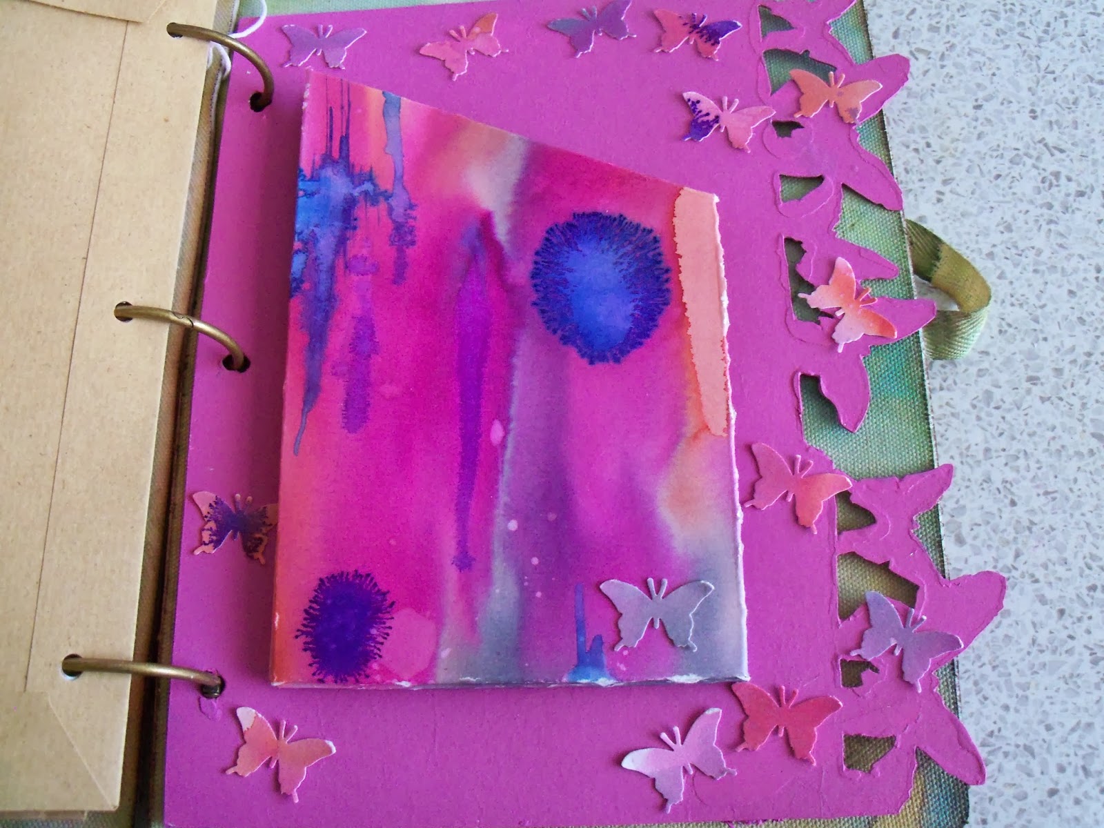
I made up a pouch for one of the dividers, using watercolour paper coloured with Brusho pigments on a Linda Knight session a couple of months back.  The colours looked right!  I also punched butterflies out of the remnants.  They glitter!  A lot!


Then I found some brown A5 envelopes, and covered them with matching gelli print papers - I think probably from an Andy Skinner session - but may have been with Linda Knight - in the pile of gelli print papers without a home...


A couple of other white A5 envelopes I tried something else...don't know why I haven't done this before...swooshed distress ink onto my mat, and instead of spraying with water, sprayed with pearl cosmic shimmer!  Wow!  Overstamped with a huge lace background stamp in a couple of different Archival inks, and then added some embellishments, which reflect my sister's great age (hah!  She'll kill me for that!!)  Land of The Giants...


On one of the envelopes, I had been playing with Stampboard - and a PaperArtsy stamp in several colours, and it fit with the theme.  So on it went!


Then I cut loads and LOADS of different papers to fit, and used my cropodile to hole punch them. 


To finish off, I used the remnants of one of the gelli papers and punched a scalloped edge.  I stamped the letters and the tags, then used he matching punch to punch them out.  Touch of stickles, and hey presto!  One birthday card, for an aged relative....  Yep, dead again!

Hope she likes!!

Resources (A selection...)

Prima Journal Covers, and various Prima embellishments - and other embellishments
Stampboard

Sizzix on the edge: Butterflies and Houses

Andy Skinner Mask (the children on the gelli plate)

Distress inks
Stewart Gill Paints
PaperArtsy Fresco paints
Brusho pigments
Cosmic Shimmers spray
Primary Elements, added to water, and sprayed, various colours

Stampin' Up: Tag stamp, and punch
Martha Stewart Butterfly punch
Hero Arts: Letter stamps
PaperArtsy Antique butterfly stamp

Wednesday, 18 September 2013

In the garden - Tando Creative

Hi all.  This week's challenge is 'In the garden'.  In my head, I saw my Mum out in the garden cutting dahlias for the chapel flowers, with an old fashioned, and indeed OLD trug.  So I started off with the 3d basket, and set to, to make it look old!

I ran all the pieces through the big shot with the Harlequin mask.  Several layers of paint later, I used the harlequin mask again and some distress ink, to really knock it back.  I forgot to take a final photo of the replacing of the mask, and the reinking - but you will see it at the end.


Then I die cut a few flowers.  More than a few actually!  I layered them up and created stems out of florist's wire, and glued some card candy over the middle, to hide where the wire went in.


All the flowers were planted into oasis, which I covered with tissue paper sprayed green. Doesn't oasis feel odd? Not sure I like it...  I had also Crop-o-dile'd a few holes through the side walls, and pressed some prima flowers through.


I stamped and embossed in gold a massive butterfly, and then painted it in Twinkling H2Os on the front.  On the back, it got a coating of Alchemy paint, to give that shimmer you see when a butterfly closes its wings.  The finishing touch was a small piece of board painted up, and then stencilled with the leaf mask, and then stamped with 'Time to Garden'.  I had two spare clock hands from somewhere, painted up in the same sort of colours as the trug and the plaque.

And now I have a reminder of my Mum's green fingers!  Wish I had inherited them!!


Now you can see the reinking, where I replaced the mask.  This shot is from the side...


...and here's the butterfly in all his glory, from above.


I've really enjoyed my month as Guest Designer for Tando.  Such a great variety of blanks, and they take paint so well.  Hope you've liked what I have done with their stuff!

Resources

Substrate: Tando Creative 3D Basket (3DBASKHAND)

Dies and Stamps
Sizzix Big Shot Pro
Sizzix: Flower, Build a flower#3 655969
Sizzix Tim Holtz Alterations:  Tattered Florals 656640, Mini Tattered Florals (Movers and Shapers) 657488, Base Tray 657007
Artemio Alpha stamps ARTA61
Stampin' Up!: Swallowtail

Paint and Ink
PaperArtsy: Nougat (my absolute favourite colour!)
IndigoBlu: Hot Cocoa, Peppermint Tea
Stewart Gill Alchemy: White Hot
Dylusions: Fresh Lime, Black Marble
Distress Ink: Evergreen Bough, Walnut Stain
Distress Stain: Evergreen Bough, Black soot
Archival Ink: Watering Can

Bling and other stuff
Twinkling H2Os: Plum Crazy, Red Pearl, Poppy Red, Persimmon
Stampendous Embossing Powder: Detail gold
Card Candy
Tando Creative Masks: Leaves set of 2 (MSKLEAVES2), Harlequin (MSKHRLQUIN)
Prima flowers, eyelets, brads, beads, oasis, florists wires, all from stash