Saturday, 26 October 2013

L is for...Craft Barn Challenge

Bit late this time, but here is my entry for the Alphabet challenge.

This week's letter was L, and I had to include a window.  Went for something fairly straight forward, which is Landscape - which seemed appropriate for a pair of French doors!


Having cut the card to allow for the 'doors', I masked off the windows, and then, out with the trusty brayer.  I created the hillocks with various shades of Adirondack, and some torn paper.

the sky was done in the same way, with the sun, distress ink mixed with cosmic shimmers (of course!!)

All the stamps are Clarity - the trees are all brilliant!

Hope you like!

Resources

Paint and ink
Adirondack: Juniper, Lake Mist, Lettuce, Stonewashed
Big and Juicy: Waterfall
Distress ink: Mustard Seed
Archival (Wendy Vecchi): Potting Shed, Fern Green

Stamps
Clarity:  trees, 3 different ones!

Bling and other stuff
Cosmic Shimmer: Pearl mist

Thursday, 24 October 2013

Glitter for little girls!

I made this for one of my colleagues at work, well, more specifically for her little girl.  We were talking about how girls do gravitate to pink after a while, and I felt the need to do something in pink!

So here is the door hanger I made for Rosie.

Back (or front?)


Front (or back)?


The background colours are mainly Distress Inks, and I used a stencil or two. 


I stamped and embossed the fairies and the word, and distressed the edges.  I added the foam letters, and then over painted with some lovely Galactica paint.  Have I mentioned I love this paint?  So much, I had to buy some other colours...  mmmmm.


On the other side of the hanger, I added loads and loads of flowers, which I had sprayed with cosmic shimmers, and some diamanté sparkles.  And another coat of the Galactica. Just in case there wasn't enough glittery stuff on it...

Hope you like, and more to the point, I hope Rosie likes...


Resources

Substrate: Stamps Away: Door hanger
IndigoBlu: Perfect Stamping card

Paint and Ink:
Distress Ink: Victorian Velvet, Worn Lipstick, Iced Spruce
Archival: Jet black
Stewart Gill: Galactica: Flamenco

Stamps and Masks
Lavinia: Fairies and words
Tim Holtz: stars
Dylusions: leaf flourish

Bling and other stuff
Stewart Gill Embossing power: Interference Red
Cosmic Shimmers: Pearl mist
Perfect Pearls spray: Interference Red
Prima Flowers: Essentials no 9
Stampin' Up: stick on gems
Papermania: Alphaminis

Thursday, 17 October 2013

Believe!

I have been playing with the lovely Galactica paint from Stewart Gill, which is me to a T!  Bright, shiny and VERY VERY sparkly!  It seems to be the perfect match for anything faerie, and so...

I started with a frame from a well known Swedish furniture store.  The glass in the frame is way too green, so that has been put to one side for another day.  The frame was sanded, and a piece of mountboard cut to the size of the card insert - that was never going to be sturdy enough for what I wanted.


I painted up the mountboard using the technique taught by Kate Crane at her Junk Journal workshop (ooh such fun!).  This means you use a couple of colours and white to create a background.  The white tones the colours down, and then you can go in full on with the same colours, to get tone on tone.  Of course, not blingy enough, so when dry it got a coat of Alchemy (a lovely sheen) followed by the Galactica (which really isn't coming out on the photo below.  It real life, however, it's where I wanted it to be!


I didn't want to stamp direct on to it, so I dug out some acetate, and stamped my Believe and my faeries.  So far, so good.  Wait for stazon to dry...  Then a touch more glitter with a gelly roll pen - I love this colour (or non colour, really).  Think snail trail, shimmer but no real colour.  Mmmmm.


Wait for stazon to dry...

I mounted the acetate up using shaker tape, so that a) the glitter would show through, and b) there would be a shadow cast on the mountboard background by the stamps above.

The frame... couldn't leave it plain!  So a thin coat of Galactica again, and repeat stamped a tiny star stamp in stazon again.  Wait for stazon to dry...!


Hope you like!


Resources:

Substrate
Frame and mountboard, Acetate

Paint and ink
PaperArtsy: Pea Coat, Haystack
Stewart Gill Galactica: Holo silver
Stewart Gill Alchemy: Seaspray
Stazon: Midnight Blue

Stamps
Lavinia: Faeries, Believe, and tiny stars

Bling and other stuff
Gelly roll pen

Thursday, 10 October 2013

Finnabair's Prima journal - birthday pressie!

A few weeks ago, I was lucky enough to do some classes with Finnabair (Anna Dabrowska)  in Swindon.  Such fun!  What did I learn?  That when you think you have applied enough trinkets, you really haven't!  Keep going and add at least 6 more!


We made up a pair of Prima journal covers, a la Finn.  I LOVED doing this, but as I was decorating it, I realised that my sister would be getting it as her birthday pressie, as she is always looking for journals (well, she'd probably call it a notebook) to keep track of her electricity reading.  Yes, I know.  Electricity readings.  Not really the stuff of scrapbooking heaven, eh?

Anyway, I won't go into all the gory details of how we decorated the covers, except to say...mmmm Primary Elements!  You can't go wrong with Black Emerald, which is a lovely DARK blue green.  Love it.

The inside dividers were packaging!  Cut with Sizzix on the edge dies, then gessoed, and painted up.  By now, if you haven't realised that I like mica, glitter, metallic stuff, well, you haven't read many of these pages, have you!  So flat base colours, then washes and glittery stuff to finish.


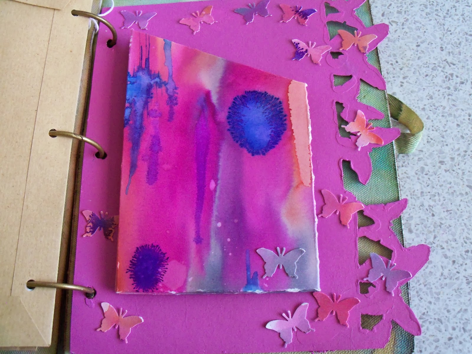
I made up a pouch for one of the dividers, using watercolour paper coloured with Brusho pigments on a Linda Knight session a couple of months back.  The colours looked right!  I also punched butterflies out of the remnants.  They glitter!  A lot!


Then I found some brown A5 envelopes, and covered them with matching gelli print papers - I think probably from an Andy Skinner session - but may have been with Linda Knight - in the pile of gelli print papers without a home...


A couple of other white A5 envelopes I tried something else...don't know why I haven't done this before...swooshed distress ink onto my mat, and instead of spraying with water, sprayed with pearl cosmic shimmer!  Wow!  Overstamped with a huge lace background stamp in a couple of different Archival inks, and then added some embellishments, which reflect my sister's great age (hah!  She'll kill me for that!!)  Land of The Giants...


On one of the envelopes, I had been playing with Stampboard - and a PaperArtsy stamp in several colours, and it fit with the theme.  So on it went!


Then I cut loads and LOADS of different papers to fit, and used my cropodile to hole punch them. 


To finish off, I used the remnants of one of the gelli papers and punched a scalloped edge.  I stamped the letters and the tags, then used he matching punch to punch them out.  Touch of stickles, and hey presto!  One birthday card, for an aged relative....  Yep, dead again!

Hope she likes!!

Resources (A selection...)

Prima Journal Covers, and various Prima embellishments - and other embellishments
Stampboard

Sizzix on the edge: Butterflies and Houses

Andy Skinner Mask (the children on the gelli plate)

Distress inks
Stewart Gill Paints
PaperArtsy Fresco paints
Brusho pigments
Cosmic Shimmers spray
Primary Elements, added to water, and sprayed, various colours

Stampin' Up: Tag stamp, and punch
Martha Stewart Butterfly punch
Hero Arts: Letter stamps
PaperArtsy Antique butterfly stamp

Tuesday, 8 October 2013

Finnabair's Canvas - completed

A few weeks ago, I was lucky enough to attend a weekend retreat in Swindon, with Anna Dabrowska (AKA Finnabair).  One of the things we did was a canvas, but it wasn't quite finished in my eyes. 

Then...I found a lovely Artemio frame at The Stamp Attic, and I knew what I wanted to do! 

We spent the weekend doing a lot of spraying, using mainly Primary Elements in solution.  These are highly pigmented mica powders.  MMMMMM. My favourite colour is called Black Emerald, and because it is my favourite, it was all over the canvas.  So it needed to be all over the frame.  So I had to order some.  Note to self, next time, get a HUGE pot!  I have a feeling I will end up painting a wall with it! 

Not sure I am going to remember every step, but here goes...  The box canvas was covered with torn strips of canvas and lace and then embellished to within an inch of its life.  The photo is a random lady, cut out, and protected from the painting and spraying that went on around it, but then dabbed with a tiny bit of pink ink (probably Picked Raspberry DI, knowing me!).  Black and white gesso, meeting in the middle. Then sprayed with the Black Emerald..  I suspect looking at it, it may also have a touch of Olive Vine, or maybe Kiwi sprayed on!


Ok, the frame.  A light sanding, then painted with white gesso.  Embellished to match the canvas, and painted all over with black acrylic.  Dry brushed with white paint from one corner.


Here comes the Black Emerald!  I made up a fairly thick solution in a spray bottle, and mostly sprayed from one corner. Then decided to go for it, and basically sprayed almost all of it!  I did leave the white corner a little light... 


When dry (I'm getting better at leaving things to dry...), I glued on the rain drops, on the frame, and on the canvas. Wish I had some more of them, no idea where they came from, but they did a good job of tying the canvas and frame together.  I love how they magnify the drops of mica, or the brush strokes.  Really lovely!

Ok, off to find ANOTHER bit of wall.  Hope you like!

Resources

Substrates:  Canvas, Artemio Box frame

Embellishments:  Prima in the main, with other bits and pieces from my stash (and Finn's!), including lace

Paint etc
Gesso
Acrylic

Bling
Primary Elements: Black Emerald (and possibly others, don't know precisely what Finn mixed up for us)
Rain drops


Sunday, 29 September 2013

J is for...Craft Barn Challenge

In my world, J is for the green-eyed god: Jealousy, Jade and Jewels. 


I got out my melt pot, and made some jewels with various colours of UTEE.  I think I made a fairly muddy fire opal, a piece of dark jade and maybe a ruby or a garnet...  I did discover that a tiny pot of Cosmic Shimmer embossing powder with glitter in it is GORGEOUS, and I wish I had a bigger pot!

I reverted to my standard card, Centura Pearl and stamped two eyes, not a pair!  They have been coloured with watercolour pencils, making the eyes really green. 

The background was done with wax watercolour crayons, and a waterbrush.

When the Jewels were cool, I glued them to the background, and created my tag in the usual way, and glued on the definitions.  The ribbon or yarn is a fantastic yarn I bought back along, and is not yet calling to me with any particular pattern!

Hope you like!

Resources

Ink and Paint
Archival Ink: Watering Can
Pentel Arts Aquash wax crayons
Faber Castell Colour Grip watercolour pencils

Stamps
Stampers Anonymous: Classics #5 SCF005

Bling and other stuff
UTEE - Mixture of Cosmic Shimmer and Ranger Clear
Crafty Notions Jewel Tones: Ruby Red
Cosmic Shimmers: Lapis Black Aurora, Bright Gold, Silver Shine, Tropic Pearl, Steel Blue Aurora
Best Flexible Molds: Caboshapes1 (PJ038)
Karantha mold: Square Pyramid, Cabochon

Eynsham Hall with Linda Knight

Last weekend I was in glorious Oxfordshire, getting messy with Linda from Just Scrapbooking.  Another fantastic weekend of tips and techniques and new tools.  Now, when's the next one...?!

Don't think I could possibly go through all the different things we did, so I am only (hah! ONLY!) posting the photos of end results.  As any regular reader of this blog will know, my family is not a great photographing family, old ones are few and far between, so I tend to use either Clark Gable or some random copyright free photos.    


Paris: Watercolour paper (lovely and heavy) with watercolour pigments, then 'scraped through' with a credit card (or similar!).  The Montage chip had the watercolour pigments dabbed on.  All sprayed with cosmic shimmers for bling.


Talk Talk - Using a face mask (!) I cut loads of faces out in positive, and used one of the negatives.  I LOVE the song Talk Talk, so I wrote the words out for a few lines on ripped book pages.  The black stuff on the frame is called 'webbing' and it's magical!!


Having started on a song theme, I went for Wuthering Heights for this romantic copyright free photo.  The background is a feather stamp with acrylic wax.  When completely dry, swooshed over with acrylic paint.  I was just about to go for tea, when I found the magpie feather outside, and it just had to be added. 


When I was little (I was once), I lived in Newcastle.  I still think of it as home, and the song 'The Fog on The Tyne' brings all sorts of memories for me.  Thanks to whoever posted the photo, as I found it online, and it is perfect!  I also used the record label to partially frame it.  The key thing here is tho, the pink and grey background.  It's on something called YUPO paper, which is really plastic-y.  It works really well with watercolour pigments. 


Limelight: Clark (my hero) shows what happens when you use watercolours over photos - and book pages.  Linda also made us rip our photos - that's quite liberating too!  More use of the credit card to apply the grid lines in gesso.


Me and Mum - This one is INCREDIBLY heavy.  Acrylic paint mixed with heavy gel.  I wanted to pull the colours from the curtains in the photo out, hence the orange and blue.  I flicked (a la Pollock) some cream over the top, using an old toothbrush.  Then added a frame in the orange for the colour photo.  I fussy cut a black and white version of the same photo.  With hindsight, it needed more highlight to make it pop, but as I keep saying, it's all about the technique...


Last but not least, finally, I did some beeswax stuff - might even start to use my own... Background is Gelli plate printed, using some of my fave Prussian Blue with some Stewart Gill Alchemy (metallic shimmer) as well, on a pale grey card.  I rolled up the torn book pages, and dipped them in beeswax.  The butterflies were stamped on book pages, coloured with Inktense, and dipped.  The flowers are plain white Prima flowers, absolutely soaked with water, with a tiny touch of watercolour pigment touched to the edges.  Remember doing chromatograms in general science with Miss Floyd?  Mmmm smarties...same effect!!
 
Hope you like!