Well! This week's Craft Barn Challenge is Y. I think I have the best dictionary in the world! Mum's trusty Collins Concise came up with Y is for Yggdrasil and Yarn. I had forgotten my Norse myths and legends, and then this! Which meant Yarn was going to make me think of all the fairy tales my Dad used to tell me when I was a kid.
I opted for Journalling on this piece - I'm not really comfortable with journalling, that is, WRITING, as I like stamping really, but hey ho, that's what this challenge is all about.
So, usual size and base cards, to match the rest of my book. This time though I created the flap, so I would have more space to write inside, and keep the tree on the outside.
The tree is stamped on a brayered base. The tree and the leaves are Lavinia stamps. I touched the tree bark up with some gold watercolour paint - that's just shimmery yellow, isn't it?!
On the inside, I used a lovely stencil which is letters (you need letters to make words, so you can spin a yarn...). Having stencilled through with a pale yellow ink, I rotated the stencil 90 degrees, and sprayed dylusions through it - and some gold shimmer of course!
Then I used a perspex journalling thingy to create my wavy lines. My first fairy tale is The Miller's Daughter who could spin pure straw into gold. Below is The Tinderbox (the dog with eyes as big as saucers), and Red Riding Hood (what big eyes you have).
On the inner flap, we have Goldilocks (Who's been sleeping in my bed?), and 'Beware the men who are hairy on the inside' is from The Company Of Wolves - great film, that line has always stuck with me!.
All the writing was done with Sharpies - don't they smell!?
As usual, I created a tag to hold the dictionary definitions, and used some real yarn (I must get round to finishing that cardy off!!) instead of ribbon.
Hope you like!
Resources
Paint and Ink
Versafine:Spanish Moss, Majestic Blue, Imperial Purple
Distress: Gathered Twigs
Adirondack: Denim, Sunshine Yellow, Caramel, Oregano
Stampin' Up: So Saffron
Dylusions: Pure Sunshine
Cosmic Shimmer Watercolour: Rich Gold
Stamps
Lavinia: Tree stump, Vine leaves
Bling and other stuff
ArtistCellar 6x6 Stencil: Romans
Wool from stash
Sharpies - various colours
Wooden lette from shash
Saturday, 20 July 2013
Build me up Buttercup - Hels Sunday Stamper
Hi all! This week, Hels' Challenge was Build Me Up Buttercup - all about layers. I did the layers, but stuck with the buttercup idea as well.
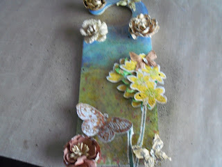
Not sure it comes out well on the photo, but there is the main door hanger, which was covered with coated cardstock, and then acetate above that.
So a bit more detail: I've got back into alcohol inks as a background, so on the glossy cardstock I created a meadow and sky sort of background. I scraped translucent paste through a flower mask. As the paste dried it pulled through a little of the ink behind (not much, as in this heat the alcohl ink dries REALLY quickly!!)
I stamped the buttercup twice onto cardstock, and then on to some dried out babywipes! Someone at work decided to rip into the packet of babywipes, rather than go in through the top, the normal way. They dried out and were about to be stuck in the bin, but no... I think I had three stuck togther, and they were a bit like a piece of felt! Dripped on gold and green alcohol ink and left it to dry. The cardstock I used detail clear embossing powder over gold ink, then coloured them in with promarkers.
I cut the acetate to size, and dabbed a bit more gold (and pearl) alcohol ink mixative on the back side of it. I mounted it up on foam squares, which I then had to cover (oh dear, more bling!) with some lovely prima flowers and butterflies. I had a gilding flakes butterfly left over from the IndigoBlu challenge last week, and if THAT wasn't bling-y enough, a couple of squirts of mica sprays, just to tie it alltogether. Suspect I may have been a bit heavy handed on that one, but hey, does it shimmer in the sunlight! And that was the effect I was going for!!
Hope you like!
Resources
Substrate - Stamps Away Door Hanger
Paint and Ink
Adirondack - Alchol inks, various colours
Brilliance ink - Pearlescent Ivy, Galaxy Gold
Promarkers - various
Stamps
PaperArty Hotpicks - HP1009 Happiness
IndigoBlu - Wild Meadow WM1
Bling and other stuff
Dreamweaver Embossing paste - translucent
Prima Sunrise Sunset flower stencil
Prima flowers and butterflies, mainly Engraver range, I think...
Stampendous embossing powder - detal clear
Acetate from stash
IndigoBlu Megaflakes - Lancashire tart
Cosmic Shimmer Shimmer mist - tarnished gold, bronze blush
Not sure it comes out well on the photo, but there is the main door hanger, which was covered with coated cardstock, and then acetate above that.
So a bit more detail: I've got back into alcohol inks as a background, so on the glossy cardstock I created a meadow and sky sort of background. I scraped translucent paste through a flower mask. As the paste dried it pulled through a little of the ink behind (not much, as in this heat the alcohl ink dries REALLY quickly!!)
I stamped the buttercup twice onto cardstock, and then on to some dried out babywipes! Someone at work decided to rip into the packet of babywipes, rather than go in through the top, the normal way. They dried out and were about to be stuck in the bin, but no... I think I had three stuck togther, and they were a bit like a piece of felt! Dripped on gold and green alcohol ink and left it to dry. The cardstock I used detail clear embossing powder over gold ink, then coloured them in with promarkers.
I cut the acetate to size, and dabbed a bit more gold (and pearl) alcohol ink mixative on the back side of it. I mounted it up on foam squares, which I then had to cover (oh dear, more bling!) with some lovely prima flowers and butterflies. I had a gilding flakes butterfly left over from the IndigoBlu challenge last week, and if THAT wasn't bling-y enough, a couple of squirts of mica sprays, just to tie it alltogether. Suspect I may have been a bit heavy handed on that one, but hey, does it shimmer in the sunlight! And that was the effect I was going for!!
Hope you like!
Resources
Substrate - Stamps Away Door Hanger
Paint and Ink
Adirondack - Alchol inks, various colours
Brilliance ink - Pearlescent Ivy, Galaxy Gold
Promarkers - various
Stamps
PaperArty Hotpicks - HP1009 Happiness
IndigoBlu - Wild Meadow WM1
Bling and other stuff
Dreamweaver Embossing paste - translucent
Prima Sunrise Sunset flower stencil
Prima flowers and butterflies, mainly Engraver range, I think...
Stampendous embossing powder - detal clear
Acetate from stash
IndigoBlu Megaflakes - Lancashire tart
Cosmic Shimmer Shimmer mist - tarnished gold, bronze blush
Sunday, 14 July 2013
Summertime Miracles - IndigoBlu Challenge
This month's challenge is extremely aposite! Summertime? Oh yes! Probably way too hot to be stuck in the craftroom, but on the basis that I would be a lobster by now, if I was outside...
Someone made a comment on C&C the other week about landscape DL cards, and I thought "why not?" So I started with a lilac card and matching envelope. I cut some Centura pearl to fit, and then started with the stamping!
I wanted to create a feeling of depth in a meadow, so I stamped the first layer half way up the card in a pale colour, 2nd generation. Brought the next layer down a bit, in another colour etc etc. When I got close to the bottom of the card, I did a 2nd generation in the green, and then a first generation. On this final layer, I tinted a couple of the flowers in purple.
Over the top I stamped the dandelion heads, doing a 2nd generation off the page on the sentiment piece.
I used Distress Inks for the sky, and also to edge both pieces of card.
Then for the fun! I stamped the dandelion clocks in FlitterGlu, and the sentiment, and then used the gorgeous Lancashire Rose mega flake. I also stamped the butterfly on a piece of card, and on the envelope. I cut out the butterfly on the card, and applied a little colour with distress markers, and moved it about with a water brush.
Hope you like!
Resources
Papermania lilac DL card
Paint and Ink
Adirondack: Purple Twilight, Lettuce, Juniper, Lake Mist, Pink Sherbet
Distress Ink: Shaded Lilac, Tumbled Glass
Distress Ink markers: Milled Lavender, Barn Door, Spun Sugar, Dusty Concord
Stamps
IndigoBlu: Wild Meadow WM1
Bling and Glitz
Mega flake: Lancashire Rose
Saturday, 13 July 2013
My Favourite Artist... Tando Challenge
Hi all! The current challenge from Tando is my favourite artist. I have taken a musical view of this, as there is not a chance of me doing a Titian or similar! I have been thinking about a wall hanging like this for a while, and finding these wonderful canvas boards galvanised me into action! I love the music of Southside Johnny and the Asbury Jukes, it really puts a smile on my face, so here it is!
As I said, I started with a 12 by 12 canvas board - I first came across Southside in the days of vinyl, so it seemed right to mimic an album sleeve, sort of. I had in my possession a 30th anniversary sticker, unused from a gig when I first moved to Bristol. The sticker is the same size as a record label, so, that is where I started. I cut a rough circle from black paper, and used a toothbrush with some silver and black acrylic paint to mimic grooves.
I swooshed several shades of blues onto the canvas, in similar shades of blue to the sticker. Then I used the end of a kitchen roll tube to add white circles on the canvas. finally, I used a music stamp around the edge.
I then tore some corrugated cardboard and stripped it back a bit, and painted it to match, including the white circles.
A couple of months ago, I made up a Tando desk tidy. It came with musical notations,; I didn't use them on the desk tidy, but they were perfect for this!! I painted them up with black acrylic but they got lost against the black card. So I recoloured them in silver.
I have a LOT of Southside albums - the biggest section in my CD collection. It was difficult to choose which ones I wanted to use on my hanging, but these albums all have a special song on them, or I bought at a gig, or some other happy memory. I printed them off on the computer, having resized them all to match. I sprayed them with a fixative, and then with a spray gloss, to make look a little like album sleeves, and mounted them on the painted corrugated cardboard.
I used my Cropodile to set in some eyelets, and a piece of sari silk as the hanger. Still not quite sure about this bit, but having made the holes, it will be easy to change the hanging accoutrements when I make my mind up.
I assembled the various pieces, and now I have a wall hanging which will make me smile every time I look at it. If you need a bit of rhythm in your life, listen to The Fever or Hearts on Fire (not on YouTube unfortunately!)...if you get the chance to see them, take it! I guarantee you will be grinning after 10 minutes, if not sooner!! Just brilliant live!
PS I love them so much, guess what car I have? Yup, a Juke!! Haha!
Hope you like!
Resources
Substrate - 12 x 12 canvas board
Paint and Ink
IndigoBlu: Grandma's Teacup
DecoArt: Traditions Prussian Blue, Cobalt Blue; Americana Lamp Black
PaperArtsy:Pea Coat translucent
Adirondack: Silver Paint dabber
Stazon: Midnight Blue
Stampin' Up:Whisper White Pigment ink
Stamps
Kitchen Roll tube (!)
Prima: Recital 4x6
Bling and other stuff
Cosmic Shimmer dries clear glue
Sari silk
Sunday, 7 July 2013
Remarkable! - Wendy Vecchi Challenge
Hi all - yes, another one from me! I am on a roll. Apologies to my neighbours for the state of the lawn...
This is actually a birthday pressie for a friend and colleague, who is using the word REMARKABLE as our vision! But as I was putting it together, I realised that it does also fit with this month's Everything Wendy Vecchi group challenge, which is Anything Goes.
This is another one of my lovely 8 x 8 canvas boards. OMG, do they take paint nicely! OMG, are they happy with heat guns! I have now got some in 12 x 12 size waiting in the stash, so I have a feeling papers for scrapbook pages will soon be a thing of the past!
Anyway, having bought some IndigoBlu paint yesterday, I wanted to give it a trial. This is REALLY pigment rich. I mixed it with white gesso, and then a bit more, and then a bit more. I suspect I may have wasted more than I used. Note to self...less is more!! I am amazed at how yellow my base coat became, considering the colours I used.
I dabbed some distress embossing ink through a stencil, and heat embossed in gold. I stencilled (very faintly) two of the Andy Skinner faces in Vintage Photo, as there is no point being remarkable unless people notice!!
Then I hand stamped the very, very lovely honeycomb stamp from our Wend (how very presumptious of me!!), also in Vintage Photo, and dolloped some modelling paste (which was mixed with embossing powder, not that you'd know) through Wend's polka dot mask. Set that aside to calm down!
I love Art Parts! Such a cool idea, die-cut chipboard and a matching stamp! Stamped and embossed the bee with gold embossing powder, and then dabbed her wings with a glue pen, which when the glue went tacky, I covered with holographic tape, to make her wings really shimmery.
Then, out came the Big Shot! I cut the letters out of funky foam, using the Wordplay die. They have all been painted or daubed randomly with the same colours of paint. When it had soaked in a bit, I liberally sprayed the whole lot with some dylusions and some cosmic shimmers.
Then I went and watched the last set of the Men's final!! I snivvled a bit (I always do at other people's efforts!), then pulled myself together and came back and glued it all together.
I touched up the edges of the letters with a little inka gold (as you know, I do like my bling!) and went round the edges of the board with a little more.
Hope you like (and I hope my chum likes too!)
Resources
Substrate
Q Art Canvas board 8 x 8
Sizzix Time Holtz Alterations BigzXL die: Wordplay 657837
Ink and Paint
IndigoBlu Acrylic Paint: Burning Bonfire, Hot Cocoa
Distress Ink: Vintage Photo, Black Soot, Embossing ink
Dylusions: Marble Black, Pure Sunshine
Pebeo Gesso
Stamps and Stencils
Studio490: Art For You LCS093, Just Word Art SCS033
Studio490 Art Parts: Bugs and Butterflies
Studio490: Dots and Stripes borders
Andy Skinner: Baroque
Artist Cellar: Boy Genius
Bling and Glitz
Ranger Queen's Gold embossing powder
Cosmic Shimmer Dark Bronze lustre embossing powder
Dreamweaver embossing paste: Translucent
Cosmic Shimmer mists: Tarnished Gold, Bronze blush
Holographic tape
Fun foam from stash
Inka Gold: Lava Grun, Gold
Oh I do like to be beside the seaside...ClarityStamp Challenge
Hi all! Feeling righteous, ironing done, kitchen habitable, and first piece of the day done!
The challenge this month from ClarityStamp is the seaside. Well, elsewhere on this blog, I have already told of my love for Cornwall. I decided that I'd stick with that, as stamp no 54 from the Clarity Club reminded me of St Michael's Mount - in the bay off Marazion...oh, just so beautiful. This is sort of the view I had many year's ago when I stayed at the caravan site at Long Rock some ahem, 28 years ago...only without the lovers in the boat!
Anyway, above is the finished postcard. I wanted to make it like a victorian vignette, and I did a drawing first:
I started with a watercolour card post card (it does actually have the postcard bit stamped on the back). I tore a hole in some copy paper, and cut a circle and a mask of the castle from a post it.
I stamped St Michael's Mount in black archival, and did the sea and sky with distress inks. I removed the circle and then used a little adirondack in the sun. Then I removed the mask from the castle, and coloured that in with various Pro Markers, to get the feeling of a nice warm sandstone. Yes, I do know that it's a grey granite-y colour in real life, but let's not let real life get in the way of a good picture!
I stamped the sentiment in one corner, and used the lower case scrabble letters to add penzance - that will be the first time I have used the z!!
Hope you like!
Resources
Substrate
Windsor and Newton: Water Colour postcard
Ink and Paint
Archival Ink: Jet black, Venetian Orange
Distress Ink: Salty Ocean, Shaded Lilac, Tumbled Glass, Broken China
Adirondack: Sunshine Yellow
Promarkers: Aaargh, put them away before I noted down what I used - various!
Stamps
ClarityStamp: Castle no 54, Fishing lovers, Sentiment, Alphabet lower case
Bling and glitz
erm...none!!
The challenge this month from ClarityStamp is the seaside. Well, elsewhere on this blog, I have already told of my love for Cornwall. I decided that I'd stick with that, as stamp no 54 from the Clarity Club reminded me of St Michael's Mount - in the bay off Marazion...oh, just so beautiful. This is sort of the view I had many year's ago when I stayed at the caravan site at Long Rock some ahem, 28 years ago...only without the lovers in the boat!
Anyway, above is the finished postcard. I wanted to make it like a victorian vignette, and I did a drawing first:
I started with a watercolour card post card (it does actually have the postcard bit stamped on the back). I tore a hole in some copy paper, and cut a circle and a mask of the castle from a post it.
I stamped St Michael's Mount in black archival, and did the sea and sky with distress inks. I removed the circle and then used a little adirondack in the sun. Then I removed the mask from the castle, and coloured that in with various Pro Markers, to get the feeling of a nice warm sandstone. Yes, I do know that it's a grey granite-y colour in real life, but let's not let real life get in the way of a good picture!
Then comes the lovers. This stamp has a fishing rod sticking out of the end of the boat, but I didn't ink that bit up. Then I turned it round to extend the ripples down to the edge of the postcard, and extended the sea colours down, too.
I stamped the sentiment in one corner, and used the lower case scrabble letters to add penzance - that will be the first time I have used the z!!
Hope you like!
Resources
Substrate
Windsor and Newton: Water Colour postcard
Ink and Paint
Archival Ink: Jet black, Venetian Orange
Distress Ink: Salty Ocean, Shaded Lilac, Tumbled Glass, Broken China
Adirondack: Sunshine Yellow
Promarkers: Aaargh, put them away before I noted down what I used - various!
Stamps
ClarityStamp: Castle no 54, Fishing lovers, Sentiment, Alphabet lower case
Bling and glitz
erm...none!!
A stitch in time...IndigoBlu
Way back in February, I went on an AMAZING IndigoBlu retreat up in the frozen north (it did snow!), where we did all sorts of stuff.
One of the things was a lovely MDF frame based around the IndigoBlu sewing stamps. For some reason, I couldn't quite finish it. Not sure why. BUT, this week, I suddenly knew what I wanted to do!
I don't sew. I suspect there may be an implied yet in there, but I work with someone who does. Spookily her sewing room is lilac, so I think this just had to be!
Can't really tell you too much about how I did it, but the little bottle of sequins and beads is an electric air freshener bottle. The brown lid was painted with nougat Paper Artsy Fresco paint, and then dabbed with flitter glue. I used a mixture of glass glitter and mega flake, and then sprayed it with varnish to make sure it won't budge!
I raided the button box, and wound some embroidery thread around a card bobbin, adding the tassle from my stash. The ribbon was a plain cream ribbon died with shaded lilac Distress Ink, and sprayed with a little cosmic shimmer pearl.
Back in February I had stamped the buttons from the set several times on the IndigoBlu card (it is so lovely to stamp on). Now having a better idea of what I wanted to do, I used the Shaded Lilac and a water brush to colour in a set of the buttons and cut them out, sticking them back on, with foam pads. Fortunately, I had also stamped the tape measures!
I'm told it matches the room perfectly and hubby has added a little something to enable it to hang on the wall. I'm so pleased that she's pleased!
Sorry about the photos; they seem to switch from sepia tones to white - and it is the white which is more true!
Hope you like!
Pretty Lady Canvas - with thanks to Linda Knight
I went to the Art Stamps show at Newbury racecourse on Saturday, and managed to get on one of Linda Knight's workshops. Just an hour to keep the crafty hunger at bay, but it worked!
What I love about Linda's workshops is, she gives you the ideas and techniques, and then, off you go! So we all had the same basic kit to work with, but we all produced something entirely different. I'm a bit of a pink girl, so this predominates, but others went with blues and yellows.
Anyway, the main thing was the base - a box canvas completely covered with Prima's Sunrise and Sunset papers. This is SOOOOOOO robust! Then added some music tissue paper, and the obligatory bling (well, there had to be, didn't there?!)
The edges of the book paper and the other layer of the sunrise/sunset were both distressed with scissors and then with Distress Inks (worn lipstick and fired brick, I think).
When I cut the hearts out (I really don't do hearts - but I couldn't think of anything else I could easily cut freehand!), I dabbed over a bit of spiced marmalade and fired brick, then doodled around the edges (a la JOFY) to enclose them.
When I got home I used the ribbons Linda provided to make the larger flower at the top, sticking it to red line tape and then twisting it round and round on itself.
I also finished the edges of the box canvas with musical washi tape from Tim Holtz, to keep the theme.
Can't wait to meet up with Linda again, in Frome on the 20th July. Wonder what I'll come back with from that!!
Hope you like!
(Just realised, not a stamp in sight - that's a first!!)
Monday, 1 July 2013
And I heard Mr Young sing about her... Hels Sunday Stamper Challenge
Sweet home Alabama
Where the skies are so blue
Sweet Home Alabama
Lord, I'm coming home to you
Where the skies are so blue
Sweet Home Alabama
Lord, I'm coming home to you
Oh yes, it's in my head now, Hels!! I love this song, and the sentiment. So Hels set us the challenge of Home.
I adore these Darkroom Door stamps, and the sentiment is so good too. It also fits quite well with a Crowded House song I'd much rather live in a caravan in the hills, than a mansion in the slums - another one of my favourite bands...
Anyway, enough. I started with a Kraft tag, which I swooshed through distress stains, including Tarnished Bronze.
I stamped the cowslips in three different colours, then added my favourite Tim birds.
I stamped one of the Darkroom Door cabins, and ripped up the edges, using some of the techniques in Tim's June tag (just haven't got to THAT this month...) and the same sort of thing for the sentiment.
The ribbon had the same sort of treatment with the Distress stains, but had to add a touch of Cosmic Shimmer Bronze blush, a) for the bling and b) to tie it all together.
Resources
Ink and Paint
Archival Ink: Jet Black, Monarch Orange, Venetian Orange
Distress Stain: Wild Honey, Mustard Seed, Tarnished Bronze
Distress Markers: Wild Honey, Mustard Seed, Brushed Corduroy, Vintage Photo, Pumice Stone
Stamps
Darkroom Door: Home Sweet Home DDRS041
Stampers Anonymous: Nature's Moments CMS001, Mini Ornates 064
Bling and other stuff
Cosmic Shimmer Mist: Bronze Blush
B is for...Craft Barn Challenge
Well, I think it's fair to say, I have been waiting for this one! I LOVE butterflies. And I do keep going back to the same butterfly stamps (I wonder how many times these same stamps get used on other people's pages?).
I do like to have a couple of words included in my challenge, and this one is no different - Blue and Butterfly, with a side order of Bling...
I have some glossy card stock in my stash, picked up at a show somewhen. This is the real deal when using alcohol inks, and I don't use THOSE enough!
So that is my base, three shades of blue with pearl mixative. Then stamped those gorgeous stamps from the Papillon collection in cobalt archival.
On some shrink plastic (and yes, I have done this before!), I stamped the HUMUNGOUS Swallowtail from Stampin' Up. (Note to self, remember, next time, STAZON not ARCHIVAL! Got it all over my fingers, the tweezers and the mat when I tried to use my watercolour pencils on it - whoops!) Of course, it heat sets when you shrink it, but then it isn't so easy to colour... you can if you squint a bit make out there's some BLUE and BURGUNDY on the wings - OK, squint quite a lot...
I had some lovely blue ribbons - one is a 'found ribbon' (think it might have been from a box of chocolates - can you imagine - a box of chocolates in THIS house...) and the other is from American Crafts. They complement the alcohol inks quite well, I think.
Have you noticed how much longer everything takes to dry in this heat? Except for the cosmic shimmers glue, which seems to set in the spout before I have even squeezed the bottle!
Enjoy!
Resources
Paint and Ink
Adirondack Alcohol inks: Cloudy Blue, Denim, Stream, Pearl Mixative
Archival: Cobalt
Distress stain: Chipped Sapphire
Stamps
Stampers Anonymous: Papillon CMS 106
Stampin' Up: Swallowtail
Bling and other stuff
Mirror stick ons
Shrink plastic
Ribbons
Subscribe to:
Posts (Atom)