Saturday, 16 November 2013

Q is for....Craft Barn Challenge

I was hoping that the dictionary would have the land of my birth in, but no, so I opted for something that sounds vaguely Harry Potter, and reverted to trigonometry!  Q is for QUINCUNX and QUADRANGLE this Craft Barn Challenge.


I started with the same Centura Pearl square as usual, and painted it up with Stewart Gill paints. 


I used a watermark pen and some detail black embossing powder to create the quincunx, and also to highlight the edges, being the quad.  I quite like the effect where the powder stuck to the still damp paint in places.


I stamped the flowers on the offcuts, and painted them up. I added a pearl when I stuck them down on the quad.


As usual the tag has the two definitions on, with the wooden letter and a ribbon, to match all my other pages.

Hope you like!


Resources

Ink and paint
Stewart Gill Byzantium: Cardinale
Stewart Gill Alchemy: White Hot
Archival ink: Jet Black

Stamps
Sheena Douglas A Little Bit Sketchy - Always Floral SS-SD-FLOR

Bling and other stuff
Stampin' up: Adhesive pearls
Stampendous Embossing Powder: Detail black
Versamark: watermark pen

Sunday, 3 November 2013

Orange - a la Rothko...

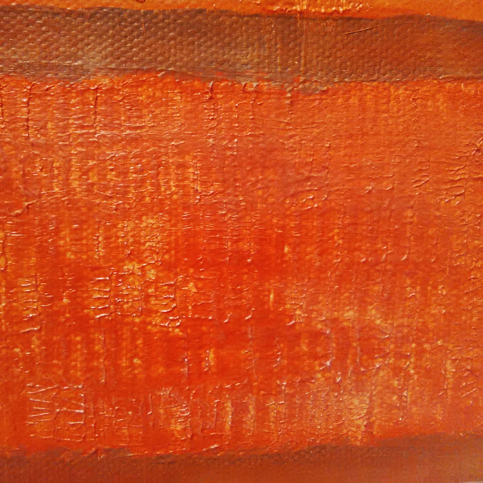
...or maybe not....!  Just a little something for my old boss... and it is significantly smaller than Mr Rothko does.  Have to say, I'm not much of an abstract lover, but I did quite enjoy making texture in the lower two panels, with the heavy gel.  But I don't think this will be selling for $hundreds of thousands any time soon.


Mr Rothko, panic not.  I am not taking your crown!


Resources

Canvas board

Paint and Ink
PaperArtsy Fresco Finish: Autumn Fire, Haystack, London Bus, Mud Splat
Heavy Structure Gel
Iridescent Medium

Saturday, 2 November 2013

N is for... Craft Barn Challenge


This week's letter in the Craft Barn Challenge is N.  Today being an auspicious day, that is, Newcastle beat Chelsea 2-0, my mind went immediately to Newcastle.  However, it isn't in my dictionary.  But... Northeast is, and, of course, Newcastle is in the Northeast.  Hence my photo of the Angel of the North, being a good representation of the land of my junior school days.  Even tho she wasn't there when I was at school; she came many years after I left, but I still love her!
 
 
As well as N being for Northeast, it is also for Numbers, and because that had a fantastically long definition (too long for the space I wanted to fill) I chose Numeric, which gave me a chance to use this lovely embossing folder.
 
So what did I do?  First, the bingo card:  I coated one side of the embossing folder with Peacock Feathers Distress Ink, and pushed it through the Big Shot Pro with my usual Centura Pearl cardstock.  When it had dried, I tapped 3 different colours of Brilliance lightly over the top.
On the other leaf, I half embossed the circles (which looked a bit compass-y to me), and painted a layer of South Pacific over it.  When that was dry, I dry brushed some gold lightly, in a north-easterly direction, milud.     I painted up the compass in the same colour gold, and added a rhinestone at the 'wrong end', and glued it to point to the north east of course.   My photo of the angel was distressed around the edge, and some more of the gold paint dry brushed along the scuffed edge.
There you go!  Hope you like!
 
Resources
 
Paint and Ink
Distress Ink:  Peacock Feathers
Brilliance: Lightening Black, Starlite Black, Coffee Bean
PaperArtsy Fresco Finish: South Pacific
Stewart Gill MetaMica: Bright Gold
 
Bling and Other stuff
Sizzix Embossing Folders: Bingo and Grungy Circles
Stampin' Up: Self adhesive gem
Tando Creative: small compass

2 Books

I have recently been on two different book related away days, one with Kate Crane (Junk Journal at the Stamp Attic in Wantage), the other with Linda Knight (Just scrapbooking, Envelope journal at the lovely Roseland Mews in Menheniot).

Neither of them are finished, as this will take some time, but I think that there is enough done to show off the general ideas!

So Kate Crane first.  Wow.  We were given a list of junk to bring along - cereal packets and the like!  Not the usual kit list to be sure... 


We started off by cutting all our pages to size, and gessoing some.  The front cover (the heaviest weight card) had Kate's paint treatment, which was such fun.  I used colours that complemented the papers I had brought along to use - Pea Coat (my favourite!) and Hey Pesto.  To accent, a really bright pink (not sure what make) and good old black. 

The spine is sticky back canvas, painted black, with polka dots in my colours. 


I brought along some papers I have had for ages, and wanted to use DCWV, Vintage Blue - there was a nice range of designs and colours, and some matching chipboards.


Kate also gave us some prints of some Gelli prints she had done, which you will see on my sister's skirt and wings, also on the house on the front cover.  (She didn't know she had wings...!)  If you're thinking 'why is there a white stripe across that page', there isn't, it's the gap between two half pages.  Not quite sure what I am going to put on the page behind yet.  But that is the point of a journal.
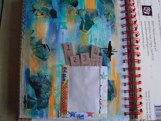


The 5 things I love page is one of Kate's pages, adapted.  I don't have 5 secrets!  So these 5 tags cover my favourite music, food etc.   I made the washi tape ages ago, but the colours seemed to match.


Also using Kate's painting technique, I painted up one of the gesso'd pages, in Orchid, Autumn Fire, and Pea Coat, and used a comb through it when nearly dry.  Like this effect...


I completed a couple of pages using a couple of ideas from the Finnabair workshop a month or so back.  One piling up the embellishments and then painting over (with the same Paper Artsy paints).  The other using Kate's painting technique, Orchid again, with black calligraphy ink - she's right, it doesn't jump out, it's just 'there'.  The Finn bit is the three strips of paper, and the tinting of the photos.


Then a week or so later, Linda's session down at Menheniot.  I got an exclamation along the lines of: 'Ruth, this isn't like you, it's so clean!'.  Hmm.  I can flex my style!!  OK, so I had some nice papers I wanted to use...


The basis of this book is what I used to know as Deed Envelopes, back in the day.  They used to hold the Epitome of Title - the lord only know what they get used for now, with registered land!!  Anyway, a bunch of these envelopes, glued together correctly (manic laughter off - I struggled with the 'correctly' bit!) and then painted up, or, in my case, covered with some nice papers.  This gives you a nice pouch for 4" x 6" matts - and a further hidden pouch, under the flap, which will also take a 4x6.


Yes it is nice and neat - so far, but there is still plenty of inking and stuff that can be done to mess it up! 


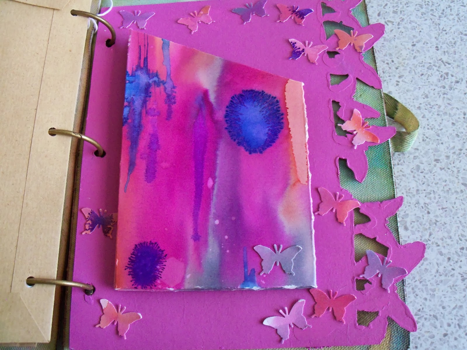
The photos you can see here are of Eden, a place I love - quite appropriate, as it's just down the road from Menheniot.  The colours in the Thai silk pennants are 'my colours' and I think that their brightness contrasts nicely with the muted tones in the two paper stacks I used (DCWV Mariposa, and Cloud 9 Hannah's Story).   And butterflies are ALWAYS good.

So I will go through my photos of my two trips to Eden and fill this little photo book up, with a few extras of St Michael's mount and St Ives.  Seems only right for a Cornish book!

Hope you like!

Saturday, 26 October 2013

L is for...Craft Barn Challenge

Bit late this time, but here is my entry for the Alphabet challenge.

This week's letter was L, and I had to include a window.  Went for something fairly straight forward, which is Landscape - which seemed appropriate for a pair of French doors!


Having cut the card to allow for the 'doors', I masked off the windows, and then, out with the trusty brayer.  I created the hillocks with various shades of Adirondack, and some torn paper.

the sky was done in the same way, with the sun, distress ink mixed with cosmic shimmers (of course!!)

All the stamps are Clarity - the trees are all brilliant!

Hope you like!

Resources

Paint and ink
Adirondack: Juniper, Lake Mist, Lettuce, Stonewashed
Big and Juicy: Waterfall
Distress ink: Mustard Seed
Archival (Wendy Vecchi): Potting Shed, Fern Green

Stamps
Clarity:  trees, 3 different ones!

Bling and other stuff
Cosmic Shimmer: Pearl mist

Thursday, 24 October 2013

Glitter for little girls!

I made this for one of my colleagues at work, well, more specifically for her little girl.  We were talking about how girls do gravitate to pink after a while, and I felt the need to do something in pink!

So here is the door hanger I made for Rosie.

Back (or front?)


Front (or back)?


The background colours are mainly Distress Inks, and I used a stencil or two. 


I stamped and embossed the fairies and the word, and distressed the edges.  I added the foam letters, and then over painted with some lovely Galactica paint.  Have I mentioned I love this paint?  So much, I had to buy some other colours...  mmmmm.


On the other side of the hanger, I added loads and loads of flowers, which I had sprayed with cosmic shimmers, and some diamanté sparkles.  And another coat of the Galactica. Just in case there wasn't enough glittery stuff on it...

Hope you like, and more to the point, I hope Rosie likes...


Resources

Substrate: Stamps Away: Door hanger
IndigoBlu: Perfect Stamping card

Paint and Ink:
Distress Ink: Victorian Velvet, Worn Lipstick, Iced Spruce
Archival: Jet black
Stewart Gill: Galactica: Flamenco

Stamps and Masks
Lavinia: Fairies and words
Tim Holtz: stars
Dylusions: leaf flourish

Bling and other stuff
Stewart Gill Embossing power: Interference Red
Cosmic Shimmers: Pearl mist
Perfect Pearls spray: Interference Red
Prima Flowers: Essentials no 9
Stampin' Up: stick on gems
Papermania: Alphaminis

Thursday, 17 October 2013

Believe!

I have been playing with the lovely Galactica paint from Stewart Gill, which is me to a T!  Bright, shiny and VERY VERY sparkly!  It seems to be the perfect match for anything faerie, and so...

I started with a frame from a well known Swedish furniture store.  The glass in the frame is way too green, so that has been put to one side for another day.  The frame was sanded, and a piece of mountboard cut to the size of the card insert - that was never going to be sturdy enough for what I wanted.


I painted up the mountboard using the technique taught by Kate Crane at her Junk Journal workshop (ooh such fun!).  This means you use a couple of colours and white to create a background.  The white tones the colours down, and then you can go in full on with the same colours, to get tone on tone.  Of course, not blingy enough, so when dry it got a coat of Alchemy (a lovely sheen) followed by the Galactica (which really isn't coming out on the photo below.  It real life, however, it's where I wanted it to be!


I didn't want to stamp direct on to it, so I dug out some acetate, and stamped my Believe and my faeries.  So far, so good.  Wait for stazon to dry...  Then a touch more glitter with a gelly roll pen - I love this colour (or non colour, really).  Think snail trail, shimmer but no real colour.  Mmmmm.


Wait for stazon to dry...

I mounted the acetate up using shaker tape, so that a) the glitter would show through, and b) there would be a shadow cast on the mountboard background by the stamps above.

The frame... couldn't leave it plain!  So a thin coat of Galactica again, and repeat stamped a tiny star stamp in stazon again.  Wait for stazon to dry...!


Hope you like!


Resources:

Substrate
Frame and mountboard, Acetate

Paint and ink
PaperArtsy: Pea Coat, Haystack
Stewart Gill Galactica: Holo silver
Stewart Gill Alchemy: Seaspray
Stazon: Midnight Blue

Stamps
Lavinia: Faeries, Believe, and tiny stars

Bling and other stuff
Gelly roll pen

Thursday, 10 October 2013

Finnabair's Prima journal - birthday pressie!

A few weeks ago, I was lucky enough to do some classes with Finnabair (Anna Dabrowska)  in Swindon.  Such fun!  What did I learn?  That when you think you have applied enough trinkets, you really haven't!  Keep going and add at least 6 more!


We made up a pair of Prima journal covers, a la Finn.  I LOVED doing this, but as I was decorating it, I realised that my sister would be getting it as her birthday pressie, as she is always looking for journals (well, she'd probably call it a notebook) to keep track of her electricity reading.  Yes, I know.  Electricity readings.  Not really the stuff of scrapbooking heaven, eh?

Anyway, I won't go into all the gory details of how we decorated the covers, except to say...mmmm Primary Elements!  You can't go wrong with Black Emerald, which is a lovely DARK blue green.  Love it.

The inside dividers were packaging!  Cut with Sizzix on the edge dies, then gessoed, and painted up.  By now, if you haven't realised that I like mica, glitter, metallic stuff, well, you haven't read many of these pages, have you!  So flat base colours, then washes and glittery stuff to finish.


I made up a pouch for one of the dividers, using watercolour paper coloured with Brusho pigments on a Linda Knight session a couple of months back.  The colours looked right!  I also punched butterflies out of the remnants.  They glitter!  A lot!


Then I found some brown A5 envelopes, and covered them with matching gelli print papers - I think probably from an Andy Skinner session - but may have been with Linda Knight - in the pile of gelli print papers without a home...


A couple of other white A5 envelopes I tried something else...don't know why I haven't done this before...swooshed distress ink onto my mat, and instead of spraying with water, sprayed with pearl cosmic shimmer!  Wow!  Overstamped with a huge lace background stamp in a couple of different Archival inks, and then added some embellishments, which reflect my sister's great age (hah!  She'll kill me for that!!)  Land of The Giants...


On one of the envelopes, I had been playing with Stampboard - and a PaperArtsy stamp in several colours, and it fit with the theme.  So on it went!


Then I cut loads and LOADS of different papers to fit, and used my cropodile to hole punch them. 


To finish off, I used the remnants of one of the gelli papers and punched a scalloped edge.  I stamped the letters and the tags, then used he matching punch to punch them out.  Touch of stickles, and hey presto!  One birthday card, for an aged relative....  Yep, dead again!

Hope she likes!!

Resources (A selection...)

Prima Journal Covers, and various Prima embellishments - and other embellishments
Stampboard

Sizzix on the edge: Butterflies and Houses

Andy Skinner Mask (the children on the gelli plate)

Distress inks
Stewart Gill Paints
PaperArtsy Fresco paints
Brusho pigments
Cosmic Shimmers spray
Primary Elements, added to water, and sprayed, various colours

Stampin' Up: Tag stamp, and punch
Martha Stewart Butterfly punch
Hero Arts: Letter stamps
PaperArtsy Antique butterfly stamp