Showing posts with label Stewart Gill Paint. Show all posts

Sunday, 27 April 2014

May - Kathryn Wheel Calendar Challenge

In an effort NOT to be late for the Kathryn Wheel challenge for May, here we go!!


 This one really is bling city...  The month and year are die cut, and then glued on.  Then, I started off with a wash of purple and then overpainted with some Byzantium (full of mica) and a bit of Alchemy (iridescent loveliness...).  When dry, I stamped some dots, some scripts and the ticket label outlines.


I die cut the tickets, distressing the edges of the weekdays, and stamping the weekends with the same ticket label as in the background, adding the numbers in blingy Brilliance ink.  The final touch was to add a group photo (happy boating men!) from Deviant Scrap (thanks for the link, Kate!!)

All glued down with redline tape!

Hope you like!

Resources

Paint and ink
Rico: purple
Stewart Gill Byzantium: Cerisanctum
Stewart Gill Alchemy: White Mist
Brilliance: Pearlescent Lavender, Galaxy Gold
Distress Ink: Seedless Preserves
Archival Ink: Deep Purple, Hydrangea

Stamps
Wendy Vecchi Studio 490: All About Art LCS011
Stampers Anonymous: Apothecary CMS138
ClarityStamp: Numbers set

Dies
Sizzix Alterations strip die: Ticket strip 656620, Inside Out 657827

Bling and other stuff
Cosmic shimmer dries clear

Saturday, 15 February 2014

February - Calendar Challenge

I'm a little late on this - where has this month gone??  February's page is a bit of a mish-mash, in that I thought - ooh February, spring, green shoots etc.  But actually, it's not, it's dark, and grey and wet.  But there has been the Olympics to provide a bit of colour...  So thanks, Kate Crane for challenging me to get on and do this!


I cut all my discs out of some Edwardian Country Diary paper I have had hanging around for way too long.  They have been sat on my workbench for a few weeks... ho hum... They are all a bit bright, but I will fix that over the month...


In my lovely book (Paperchase, 10" square), I reused Kate's gesso method for painting, using black paint with a fair amount of gesso.  Whilst it was still damp, I used some tiny amounts of red - thinking of Valentine's day, I suppose, subconsciously (I'd never think of it CONSCIOUSLY!), dragging through it with the end of a paintbrush, and also with an old bottle lid to make the Olympic rings.

I used one of Andy Skinner's stencils and my beloved Stewart Gill glittery paint, to provide some interest, and a little tippex and a big fat gold marker.

I started a little zentangling, which I will probably finish by the end of the month...maybe...

Hope you like!

Resources

Substrate: Paperchase book
Edwardian Country Diary 6x6 pad

Paint and ink
Pebeo: White Gesso
Liquitex Basics: Titanium White, Mars Black, Naphthol Crimson
Stewart Gill: Galactica Flamenco, Alchemy White hot
Edding calligraphy paint marker: Gold

Bling and other stuff
Sakura pens, various colours
Tipp-ex
Andy Skinner Mask - Sunburst

Sunday, 12 January 2014

Twilight Framed!

Following on from my post last week, I have now joined the two parts together, canvas and frame.  I am really pleased with this.


 Standard wooden box frame from The Range, just what I needed!  Removed the glass, and painted - with just a little bling, and it's perfect!

I mixed up black acrylic with my favourite glittery paint, Galactica, and smoothed it on, with a piece of cut & dry. I like this method of application for three reasons - 1) I am really not very good with a brush, 2) it's nice and even, 3) no brush marks, and 4) I am way too impatient.  OK, that's 4 reasons!! Then I stamped dandelion clocks lightly around the edge in black, silver and gold.

Having painted up the frame, I saw that the mdf pieces needed a similar treatment.

While I had some paint left over, I also dabbed it on my fantastic gold leaf braid I had bought.  As gold I knew it was the right shape (it matched the stamping and stencilling on the canvas) but it was just too bright.  Taken down a bit with black paint, it was so much better!

Then, it was just a case of adding the canvas to the frame, and adding the leaves.  Another creation that needs to be in light to get the full effect of the shimmer, but it does look really good!


Hope you like!

Resources
Substrate: Box Frame
Paint and Ink
Liquitex Basics: Mars Black
Stewart Gill Galactica: Rainbow
Brilliance: Starlight Black, Starlight Silver, Galaxy Gold

Stamps
IndigoBlu: Wild Meadow WM1

Bling and other stuff
Gold leaf braid
Silicon Glue

Saturday, 16 November 2013

Q is for....Craft Barn Challenge

I was hoping that the dictionary would have the land of my birth in, but no, so I opted for something that sounds vaguely Harry Potter, and reverted to trigonometry!  Q is for QUINCUNX and QUADRANGLE this Craft Barn Challenge.


I started with the same Centura Pearl square as usual, and painted it up with Stewart Gill paints. 


I used a watermark pen and some detail black embossing powder to create the quincunx, and also to highlight the edges, being the quad.  I quite like the effect where the powder stuck to the still damp paint in places.


I stamped the flowers on the offcuts, and painted them up. I added a pearl when I stuck them down on the quad.


As usual the tag has the two definitions on, with the wooden letter and a ribbon, to match all my other pages.

Hope you like!


Resources

Ink and paint
Stewart Gill Byzantium: Cardinale
Stewart Gill Alchemy: White Hot
Archival ink: Jet Black

Stamps
Sheena Douglas A Little Bit Sketchy - Always Floral SS-SD-FLOR

Bling and other stuff
Stampin' up: Adhesive pearls
Stampendous Embossing Powder: Detail black
Versamark: watermark pen

Saturday, 2 November 2013

N is for... Craft Barn Challenge


This week's letter in the Craft Barn Challenge is N.  Today being an auspicious day, that is, Newcastle beat Chelsea 2-0, my mind went immediately to Newcastle.  However, it isn't in my dictionary.  But... Northeast is, and, of course, Newcastle is in the Northeast.  Hence my photo of the Angel of the North, being a good representation of the land of my junior school days.  Even tho she wasn't there when I was at school; she came many years after I left, but I still love her!
 
 
As well as N being for Northeast, it is also for Numbers, and because that had a fantastically long definition (too long for the space I wanted to fill) I chose Numeric, which gave me a chance to use this lovely embossing folder.
 
So what did I do?  First, the bingo card:  I coated one side of the embossing folder with Peacock Feathers Distress Ink, and pushed it through the Big Shot Pro with my usual Centura Pearl cardstock.  When it had dried, I tapped 3 different colours of Brilliance lightly over the top.
On the other leaf, I half embossed the circles (which looked a bit compass-y to me), and painted a layer of South Pacific over it.  When that was dry, I dry brushed some gold lightly, in a north-easterly direction, milud.     I painted up the compass in the same colour gold, and added a rhinestone at the 'wrong end', and glued it to point to the north east of course.   My photo of the angel was distressed around the edge, and some more of the gold paint dry brushed along the scuffed edge.
There you go!  Hope you like!
 
Resources
 
Paint and Ink
Distress Ink:  Peacock Feathers
Brilliance: Lightening Black, Starlite Black, Coffee Bean
PaperArtsy Fresco Finish: South Pacific
Stewart Gill MetaMica: Bright Gold
 
Bling and Other stuff
Sizzix Embossing Folders: Bingo and Grungy Circles
Stampin' Up: Self adhesive gem
Tando Creative: small compass

Thursday, 24 October 2013

Glitter for little girls!

I made this for one of my colleagues at work, well, more specifically for her little girl.  We were talking about how girls do gravitate to pink after a while, and I felt the need to do something in pink!

So here is the door hanger I made for Rosie.

Back (or front?)


Front (or back)?


The background colours are mainly Distress Inks, and I used a stencil or two. 


I stamped and embossed the fairies and the word, and distressed the edges.  I added the foam letters, and then over painted with some lovely Galactica paint.  Have I mentioned I love this paint?  So much, I had to buy some other colours...  mmmmm.


On the other side of the hanger, I added loads and loads of flowers, which I had sprayed with cosmic shimmers, and some diamanté sparkles.  And another coat of the Galactica. Just in case there wasn't enough glittery stuff on it...

Hope you like, and more to the point, I hope Rosie likes...


Resources

Substrate: Stamps Away: Door hanger
IndigoBlu: Perfect Stamping card

Paint and Ink:
Distress Ink: Victorian Velvet, Worn Lipstick, Iced Spruce
Archival: Jet black
Stewart Gill: Galactica: Flamenco

Stamps and Masks
Lavinia: Fairies and words
Tim Holtz: stars
Dylusions: leaf flourish

Bling and other stuff
Stewart Gill Embossing power: Interference Red
Cosmic Shimmers: Pearl mist
Perfect Pearls spray: Interference Red
Prima Flowers: Essentials no 9
Stampin' Up: stick on gems
Papermania: Alphaminis

Thursday, 17 October 2013

Believe!

I have been playing with the lovely Galactica paint from Stewart Gill, which is me to a T!  Bright, shiny and VERY VERY sparkly!  It seems to be the perfect match for anything faerie, and so...

I started with a frame from a well known Swedish furniture store.  The glass in the frame is way too green, so that has been put to one side for another day.  The frame was sanded, and a piece of mountboard cut to the size of the card insert - that was never going to be sturdy enough for what I wanted.


I painted up the mountboard using the technique taught by Kate Crane at her Junk Journal workshop (ooh such fun!).  This means you use a couple of colours and white to create a background.  The white tones the colours down, and then you can go in full on with the same colours, to get tone on tone.  Of course, not blingy enough, so when dry it got a coat of Alchemy (a lovely sheen) followed by the Galactica (which really isn't coming out on the photo below.  It real life, however, it's where I wanted it to be!


I didn't want to stamp direct on to it, so I dug out some acetate, and stamped my Believe and my faeries.  So far, so good.  Wait for stazon to dry...  Then a touch more glitter with a gelly roll pen - I love this colour (or non colour, really).  Think snail trail, shimmer but no real colour.  Mmmmm.


Wait for stazon to dry...

I mounted the acetate up using shaker tape, so that a) the glitter would show through, and b) there would be a shadow cast on the mountboard background by the stamps above.

The frame... couldn't leave it plain!  So a thin coat of Galactica again, and repeat stamped a tiny star stamp in stazon again.  Wait for stazon to dry...!


Hope you like!


Resources:

Substrate
Frame and mountboard, Acetate

Paint and ink
PaperArtsy: Pea Coat, Haystack
Stewart Gill Galactica: Holo silver
Stewart Gill Alchemy: Seaspray
Stazon: Midnight Blue

Stamps
Lavinia: Faeries, Believe, and tiny stars

Bling and other stuff
Gelly roll pen

Thursday, 10 October 2013

Finnabair's Prima journal - birthday pressie!

A few weeks ago, I was lucky enough to do some classes with Finnabair (Anna Dabrowska)  in Swindon.  Such fun!  What did I learn?  That when you think you have applied enough trinkets, you really haven't!  Keep going and add at least 6 more!


We made up a pair of Prima journal covers, a la Finn.  I LOVED doing this, but as I was decorating it, I realised that my sister would be getting it as her birthday pressie, as she is always looking for journals (well, she'd probably call it a notebook) to keep track of her electricity reading.  Yes, I know.  Electricity readings.  Not really the stuff of scrapbooking heaven, eh?

Anyway, I won't go into all the gory details of how we decorated the covers, except to say...mmmm Primary Elements!  You can't go wrong with Black Emerald, which is a lovely DARK blue green.  Love it.

The inside dividers were packaging!  Cut with Sizzix on the edge dies, then gessoed, and painted up.  By now, if you haven't realised that I like mica, glitter, metallic stuff, well, you haven't read many of these pages, have you!  So flat base colours, then washes and glittery stuff to finish.


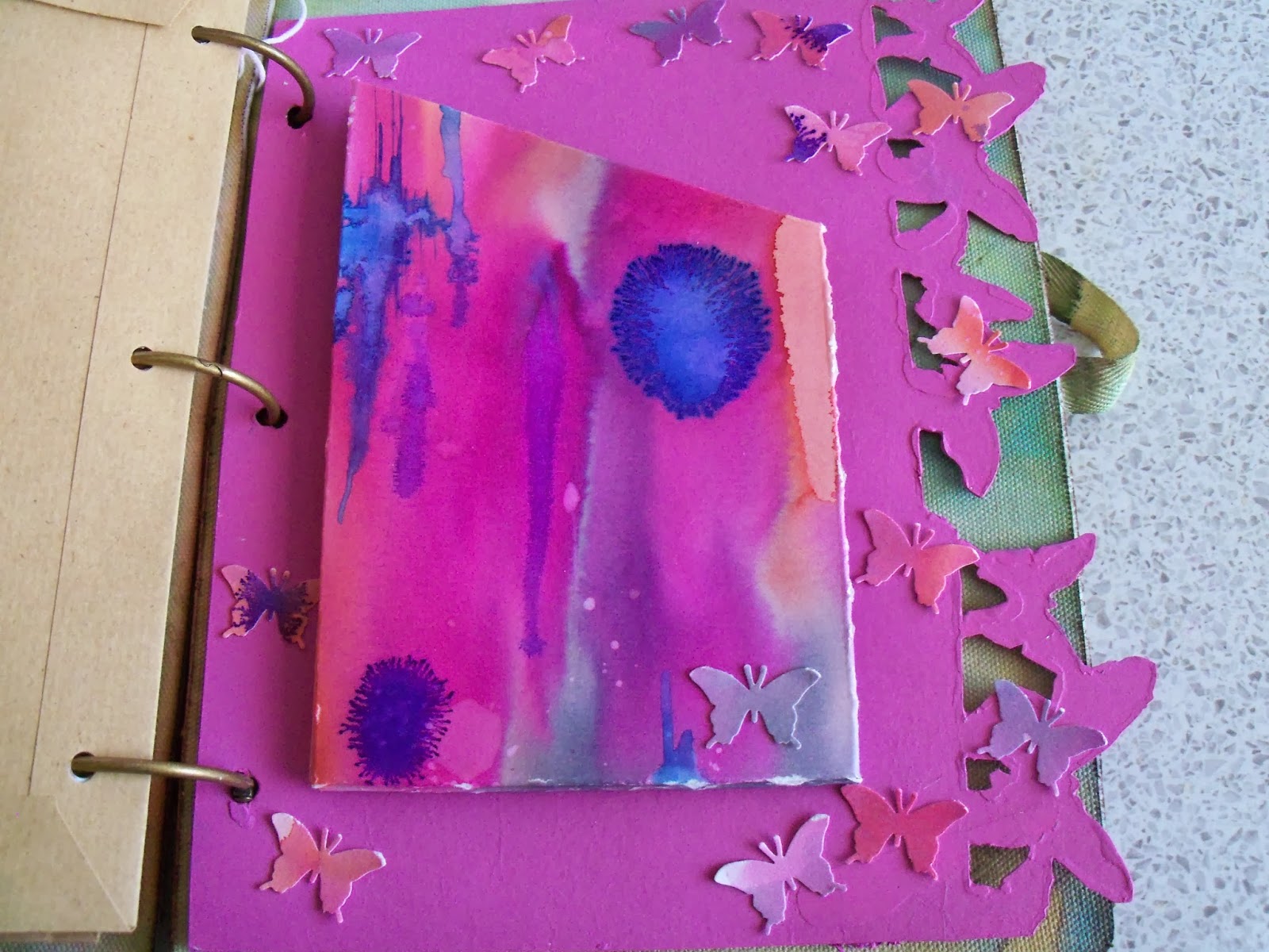
I made up a pouch for one of the dividers, using watercolour paper coloured with Brusho pigments on a Linda Knight session a couple of months back.  The colours looked right!  I also punched butterflies out of the remnants.  They glitter!  A lot!


Then I found some brown A5 envelopes, and covered them with matching gelli print papers - I think probably from an Andy Skinner session - but may have been with Linda Knight - in the pile of gelli print papers without a home...


A couple of other white A5 envelopes I tried something else...don't know why I haven't done this before...swooshed distress ink onto my mat, and instead of spraying with water, sprayed with pearl cosmic shimmer!  Wow!  Overstamped with a huge lace background stamp in a couple of different Archival inks, and then added some embellishments, which reflect my sister's great age (hah!  She'll kill me for that!!)  Land of The Giants...


On one of the envelopes, I had been playing with Stampboard - and a PaperArtsy stamp in several colours, and it fit with the theme.  So on it went!


Then I cut loads and LOADS of different papers to fit, and used my cropodile to hole punch them. 


To finish off, I used the remnants of one of the gelli papers and punched a scalloped edge.  I stamped the letters and the tags, then used he matching punch to punch them out.  Touch of stickles, and hey presto!  One birthday card, for an aged relative....  Yep, dead again!

Hope she likes!!

Resources (A selection...)

Prima Journal Covers, and various Prima embellishments - and other embellishments
Stampboard

Sizzix on the edge: Butterflies and Houses

Andy Skinner Mask (the children on the gelli plate)

Distress inks
Stewart Gill Paints
PaperArtsy Fresco paints
Brusho pigments
Cosmic Shimmers spray
Primary Elements, added to water, and sprayed, various colours

Stampin' Up: Tag stamp, and punch
Martha Stewart Butterfly punch
Hero Arts: Letter stamps
PaperArtsy Antique butterfly stamp

Sunday, 22 September 2013

G is for... Craft Barn Challenge

Well, THIS one certainly fits with the 'bright shiny sparkly' name.  This fortnight's letter from the Craft Barn Challenge is G.  G is obviously for Glitter (and/or Glister, if you are feeling a tad archaic) and for Globe, with a smattering of Gold and Green for good measure!!

I'd been meaning to use my double sided sticky sheets with the acetate for a while, and here is the perfect excuse.  I cut a circle out of the backing paper, the wax paper layer, taking care not to cut all the way through the sticky layer.  

Then I created my world (at this point, I felt a bit like Slartibartfast, only without the fjords...).  As I was born in a sunnier clime, I decided to do the 'other side', so carved a slightly odd looking Oceania, I think!  You have the former USSR, China, India, Bangladesh etc etc etc, a VERY odd Australia, the Arabian Peninsula (that's my bit) and the start of Africa.  The Med also shows, and the North and South Pole.  Apologies to all for the wonkiness of the countries. I gave up Geography in favour of German for O'level...

By carving through the backing paper carefully, it is possible to peel off the bits that need to be blue, and cover them in blue Glitter.  When all the glue is covered, then the next piece of backing gets peeled away, and green Glitter comes out and so on.

When it's all done, then the acetate goes on, to stop the shedding. 

For the first time in this challenge, my substrate is NOT Centura Pearl!  I was away from home, so used a piece of oil paint paper, which has a lovely texture.  It's been painted in my favourite Prussian Blue, and then (of course) some more glitter paint, to represent the Galaxy (Darn!  Forgot that definition!!  Missed opportunity!)

The tag, which has the definitions on, has been slid in between the base page, and the oil paint paper, has the usual wooden G stuck on, and some gorgeous sari silk in (wait for it) green and gold!

Hope you like!


Resources

Paint and Ink
DecoArt Traditions: Prussian Blue Hue
Stewart Gill Alchemy: Sea Spray

Bling and other stuff
Martha Stewart Glitter: Various shades
Wooden letter, sari silk from stash