Showing posts with label Kate Crane. Show all posts

Tuesday, 8 July 2014

Late again - July's Calendar Challenge

Oh dear, story of my life, late again...  And I even started this 2 weeks ago!  So, it's Kate's monthly calendar challenge, for July, and I have gone with flowers.  For summer.


My base colours are unusual for me, taupe and yellow. Not quite sure where that idea came from.  As I say done a couple of weeks ago, and allowed to dry (well!).  As seems to be usual, I added in some iridescent white to the lovely Paper Artsy paints, to give me some bling, all over the top of CLEAR gesso this time.  Not sure about this.  It saved me embarrassment (see last month's post!), but the type I had dried quite quickly.  It meant the colours of paint stayed truer, but...


Then, because I was late, and also because I felt like doing something freehand, I got out my Pitt pens.  They work beautifully on top of acrylics.  Fairly random 'squares', but it looked a bit bland.  So I added in some of the 'known knowns' in terms of dates, and yippee!!  JOFY at the end of the month...so out came the JOFY stamps.  A bit of colouring (with the tongue hanging out of the corner of my mouth, of course) and it all looked a little better.

(When the lovely Mr Skinner bring some more (rubber) stamps out, I shall, of course, use them...and the antiquing cream...ahem!).

Hope you like!

Resources

Paint and Ink
Archival Ink: Fern Green
PaperArtsy Fresco finish: Mud Splat, Haystack
Winsor and Newton: Iridescent white; clear gesso
Pitt pens: Various colours

Stamps
PaperArtsy, JOFY stamps: JM34 (flowers) JM35 (bay tree)

Bling and other stuff
Hmmmm, only the iridescent paint above!  Poor showing, Mooffie!

Sunday, 15 June 2014

Kathryn Wheel - Calendar Challenge June

Yes, late again...ah well.  This month (since I have started a new job, really) I have felt like I am chasing my tail, so I went with an Alice in Wonderland theme, mostly

'I'm late, I'm late for a very important date, no time to say 'Hello' - 'Goodbye'....'  Here are my two pages:


On Kate's last session at the Stamp Attic she made a comment along the lines of 'you don't have to start with gesso on your page, but if you don't, it's a bit like going out without your knickers.  It'll probably be OK, but you just don't know...'  So I started with gesso. In honour of flaming June, I went with a yellow and blue theme.  I dragged a hotel key card through some black paint too, just for a contrast.


When it was dry, I used a clock face mask, and a selection of Alice related stamps.

I die cut loads of pocket watches from card, and randomly stamped more of the Alice stamps on them.

Stuck them all down, and hey presto!

Hope you like

Resources

Ink and Paint
Liquitex basics: Ultramarine Blue, Cadmium Yellow, Black
Winsor & Newton: Iridescent white
Distress Ink: Squeezed lemonade, Mustard Seed, Salty Ocean, Stormy Sky, Mowed Lawn
Archival: Cobalt

Stamps
TJ Design: Wonderland Silhouettes
Deep Red: Mat Hatter Tea Party

Bling and other stuff
Pebeo Gesso
Tim Holtz Collection Layering Stencil: Clockwork
Tim Holtz Alterations Movers and Shapers: Mini Clock Key & Pocket Watch

Sunday, 11 May 2014

Q&L: Fame - Life's been good

Hi there!  The challenge this fortnight was Unique and/or Fame.  I was struggling, then the good old iPod did it again...  Life's been Good by the Eagles (or Joe Walsh), and yes, I have seen them a couple of times!  I'll be able to stick all my old ticket stubs into the book at the end of this!  So here is the verse:

It's a difficult one to illustrate, this, so I didn't!  I went for abstract.

My A3 substrate this time was watercolour paper.  Because I wanted to move the acrylic about on the paper, I gave it a coating of Matt Medium (which I managed to squirt all over my trousers, my T-shirt, the floor, before I got it on the paper...), and then used the Eclectica limited edition Paper Artsy paints in blocks, with a smidge of Nougat, for graduation. 

My Kate Crane/Kathryn Wheel stamps turned up yesterday, so I used two half circles on the lower edge, and outlined them in white. 

In keeping with the fame theme, I stamped stars in metallic Brilliance around the edge, leaving a gap for the words.

Added the words, and details of the song/band, and hey presto!

Hope you like!

Resources

Substrate
Winsor and Newton Cotman Water colour paper

Paint and Ink
PaperArtsy: Tikka, Chartreuse, Chutney, Nougat
Distress Ink: Black Soot
Brilliance: Mineral

Stamps
Hero Arts: Life of the Party Stars

Bling and other stuff
Edding 751 creative: White Marker
Pitt Calligraphy pens: Black
Winsor and Newton: Acrylic Matt Medium

Sunday, 27 April 2014

May - Kathryn Wheel Calendar Challenge

In an effort NOT to be late for the Kathryn Wheel challenge for May, here we go!!


 This one really is bling city...  The month and year are die cut, and then glued on.  Then, I started off with a wash of purple and then overpainted with some Byzantium (full of mica) and a bit of Alchemy (iridescent loveliness...).  When dry, I stamped some dots, some scripts and the ticket label outlines.


I die cut the tickets, distressing the edges of the weekdays, and stamping the weekends with the same ticket label as in the background, adding the numbers in blingy Brilliance ink.  The final touch was to add a group photo (happy boating men!) from Deviant Scrap (thanks for the link, Kate!!)

All glued down with redline tape!

Hope you like!

Resources

Paint and ink
Rico: purple
Stewart Gill Byzantium: Cerisanctum
Stewart Gill Alchemy: White Mist
Brilliance: Pearlescent Lavender, Galaxy Gold
Distress Ink: Seedless Preserves
Archival Ink: Deep Purple, Hydrangea

Stamps
Wendy Vecchi Studio 490: All About Art LCS011
Stampers Anonymous: Apothecary CMS138
ClarityStamp: Numbers set

Dies
Sizzix Alterations strip die: Ticket strip 656620, Inside Out 657827

Bling and other stuff
Cosmic shimmer dries clear

Saturday, 19 April 2014

April - Kathryn Wheel Calendar challenge

Over half way through April, and I finally do my Calendar page!  Busy month...  Anyway, here are my pages.


I started by painting the pages with fairly runny gesso, and then brushing through with two shades of green, with added iridescent shimmer (not enough, methinks).

While the paint was still wet, I used a plastic tube to make circles/bubbles, some right through to the white, and some through as far as the lime green.

I cut the card for the pockets, and while still flat, stamped the decoration in archival ink.  I used red line tape to stick them down.  I used the same card to cut the daily ribbons from, and numbered them for April, adding SAT and SUN (so I could work out which go in which pocket).


I doodled (yes freehand DOODLED!) April, with a little very basic zentangle - it's not really my thing. And then, out with the various white pens to add a little perspective to some of the bubbles.

Hope you like!


Resources

Paint and Ink
PaperArtsy: Limelight
DecoArt Traditions: Phthalo Green-Blue
Windsor & Newton: Iridescent white
Pebeo Studio White Gesso
Archival Ink: Jet Black, Dandelion, Sap Green

Stamps
Prima: Stationer's Desk, Finnabair dots

Bling and other stuff
Faber Castell Pitt pens - Various
Pilot super colour pen - White
Sakura gelly roll - Starlight

Sunday, 2 March 2014

Calendar Challenge - Kathryn Wheel

Well it's March already.  It's still flippin' cold here tho, but I do spy some green shoots out there, t'other side of the glass.  You don't think I'd be going OUT there?  Are you mad?!!


Anyway, Kate Crane's Calendar challenge beckons, so I set to, with some of the gorgeous JOFY limited edition paints.  mmmm.  I got JOFY's Bloom and Grow stencil out too, and used some more paint.  While I was at it, I stencilled, using the bubbles mask, also PaperArtsy, but Lin Brown this time.


I stamped my circles for the days using a measuring cup, and coloured in the Saturdays and Sundays with a little mica powder - it needed bling...


Then out with other JOFY stamps, for the daisy, the butterfly, dragonfly and bunting. A little distress marker colouring in, and more mica powder!

Hope you like!

Resources

Paint and Ink
PaperArtsy: Dolly Mix, Dusty Teal
Archival Ink: Jet Black, Deep Purple
Distress ink: Mowed lawn, Picked Raspberry
Distress markers: Picked Raspberry, Seedless Preserves

Stamps
PaperArtsy: JOFY13, JOFY14

Bling and other stuff
LuminArte: Iridescent blue
PaperArtsy Stencils: Lin Brown PS001, JOFY PS008
Sakura Jelly roll pens: Various

Saturday, 15 February 2014

February - Calendar Challenge

I'm a little late on this - where has this month gone??  February's page is a bit of a mish-mash, in that I thought - ooh February, spring, green shoots etc.  But actually, it's not, it's dark, and grey and wet.  But there has been the Olympics to provide a bit of colour...  So thanks, Kate Crane for challenging me to get on and do this!


I cut all my discs out of some Edwardian Country Diary paper I have had hanging around for way too long.  They have been sat on my workbench for a few weeks... ho hum... They are all a bit bright, but I will fix that over the month...


In my lovely book (Paperchase, 10" square), I reused Kate's gesso method for painting, using black paint with a fair amount of gesso.  Whilst it was still damp, I used some tiny amounts of red - thinking of Valentine's day, I suppose, subconsciously (I'd never think of it CONSCIOUSLY!), dragging through it with the end of a paintbrush, and also with an old bottle lid to make the Olympic rings.

I used one of Andy Skinner's stencils and my beloved Stewart Gill glittery paint, to provide some interest, and a little tippex and a big fat gold marker.

I started a little zentangling, which I will probably finish by the end of the month...maybe...

Hope you like!

Resources

Substrate: Paperchase book
Edwardian Country Diary 6x6 pad

Paint and ink
Pebeo: White Gesso
Liquitex Basics: Titanium White, Mars Black, Naphthol Crimson
Stewart Gill: Galactica Flamenco, Alchemy White hot
Edding calligraphy paint marker: Gold

Bling and other stuff
Sakura pens, various colours
Tipp-ex
Andy Skinner Mask - Sunburst

Wednesday, 8 January 2014

Twilight Canvas

I have had this post sat sitting in draft for a month or so.  I have had the canvas sat sitting on the side for a month too!  It needs a frame, and I think I may have found one, but I'll get this posted as is for now, and follow up with the frame...at some point...!


I picked up a 'paint your own canvas kit' recently in a sale.  I ummed and ahhhed for a bit, but thought that the mdf cutouts were probably worth the price on their own.  So I bought it, knowing I would do something with it at some point.  I also bought a magnolia version, which is still in the cupboard.


So, as you may know from elsewhere on this blog, a few months back, I attended a Kate Crane workshop, and I have her DVDs.  In Bold Backgrounds she uses Dylusions to create some pages, and I really liked the effect.  So...  the canvas was already primed, so I used three colours fairly close on the colour wheel, and sprayed liberally.  Then I cleaned up the work surface!  I had a tiny bit of two colours of Primary Elements left over in spray bottles, so they went on as well.


I used two stencils and sprayed water through, and a touch more ink.  I wanted to create a frame, so used the leaves stencil (also Dylusions) as I knew I had the matching stamps.  I scraped gesso through the stencil. Two things here.  One: the gesso was a little runny, so the edges aren't as sharp as they might have been.  Two: I suspect the base wasn't entirely dry (nothing new there!).  This meant that some of the dye got pulled up into the gesso, so it isn't bright white.  At the top, where it was on the African Midnight colour, it looks like I stamped with bleach!  A happy accident!

Then (and I did wait for the gesso to dry!) I stamped with the matching stamps around the edge.


Meanwhile, the dandelion clocks needed to be painted, so I mixed a dark green acrylic with black and slathered it on, making sure I got in between the petals.


So far, so good.  Next step, the frame and joining the two things together!  Watch this space (but don't hold your breath...!)

Hope you like!

Resources

Substrate: 12 x12 canvas
MDF flowers and leaf

Paint and Ink
Dylusions Ink Sprays: African Midnight, London Blue, Fresh Lime
Primary elements (in spray): Black Emerald, Wisteria (probably!)
Liquitex basics: Phthalo Green, Mars Black
Archival Ink: Jet Black, Olive, Fern Green,

Stamps
Dylusions: Around The Edge DYR34421, Doodle Parts DYR34582

Bling and other stuff
Pebeo white gesso
Dylusions Mask: Leaf Flourish small DYS38382
Tando Creative Mask: Harlequin MSKHRLQUIN
Tim Holtz Layering Stencil: Bubble THS002

Saturday, 4 January 2014

Monthly Calendar - January

I went on one of Kate Crane's weekends last year, at the Stamp Attic, and really enjoyed it, so I have decided to have a go at doing Kate's Calendar Challenge this year - details are on her blog, The Kathryn Wheel.  I am going to start off slow and steady, so I don't burn out too early!  I am rubbish at diaries and the like, and have trouble doing anything regular, like even keeping my accounts up to date... oh dear.


I found this lovely book in Paperchase.  The paper quality is just fantastic, and I like the craft (or Kraft) covers, which I will decorate at some point.  The pages are c 9 1/2 inches square, or 24 cm.  Slightly cream or ivory.  But , oh so thick!


I decided January had to be green - my garden is sooooo lush - I don't mean that in a bristolian sense, more a verdant sense!  All the rain, already!  So the main part of the background is dylusions sprays, in cut grass, fresh lime and then some pure sunshine (I wish).  It wasn't quite what I was after, so I added a little white linen, which provides a little mistiness in the background.

Then out with the stencils, I love the Tando harlequin trellis, it's great.  Then Tim's Bubbles, with Picket Fence distress stain.  And an umbrella or three from the lovely Mr Skinner - very appropriate!

Then I stamped my hedgerow in - cow parsley, I think. First and second generation in two colours of Archival ink.  I also stamped the small bird from the same set on a separate piece of card, and attached it top right.

Elsewhere on this blog, I mentioned that I discovered pearlescent acrylic ink - still loving it!  Probably could have done with the Jan being a little more black, but I still like it.  There's a little doodling in black micron pens, a tippex pen, and a glittery sakura pen.

Then I drew my grid for the calendar entries.

Right, first (and only!) resolution of the year - do this every month!

Hope you like!


Resources

Paint and Ink
Dylusions: White Linen, Pure Sunshine, Fresh Lime, Cut Grass
Archival: Monarch Orange, Sepia
Distress Ink: Mowed Lawn
Distress Stain: Picket Fence
Daler Rowney FW Pearlescent Ink: Black

Stamps and Masks
Stampers Anonymous, Tim Holtz - Nature's Moments CMS001, Bubbles THS002
Tando Creative: Harlequin
Andy Skinner for Tando Creative: Accessories

Bling and other stuff
Tipp-ex pen
Micron pens
Sakura Gelly Roll pen, glittery pink

Saturday, 2 November 2013

2 Books

I have recently been on two different book related away days, one with Kate Crane (Junk Journal at the Stamp Attic in Wantage), the other with Linda Knight (Just scrapbooking, Envelope journal at the lovely Roseland Mews in Menheniot).

Neither of them are finished, as this will take some time, but I think that there is enough done to show off the general ideas!

So Kate Crane first.  Wow.  We were given a list of junk to bring along - cereal packets and the like!  Not the usual kit list to be sure... 


We started off by cutting all our pages to size, and gessoing some.  The front cover (the heaviest weight card) had Kate's paint treatment, which was such fun.  I used colours that complemented the papers I had brought along to use - Pea Coat (my favourite!) and Hey Pesto.  To accent, a really bright pink (not sure what make) and good old black. 

The spine is sticky back canvas, painted black, with polka dots in my colours. 


I brought along some papers I have had for ages, and wanted to use DCWV, Vintage Blue - there was a nice range of designs and colours, and some matching chipboards.


Kate also gave us some prints of some Gelli prints she had done, which you will see on my sister's skirt and wings, also on the house on the front cover.  (She didn't know she had wings...!)  If you're thinking 'why is there a white stripe across that page', there isn't, it's the gap between two half pages.  Not quite sure what I am going to put on the page behind yet.  But that is the point of a journal.
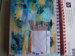


The 5 things I love page is one of Kate's pages, adapted.  I don't have 5 secrets!  So these 5 tags cover my favourite music, food etc.   I made the washi tape ages ago, but the colours seemed to match.


Also using Kate's painting technique, I painted up one of the gesso'd pages, in Orchid, Autumn Fire, and Pea Coat, and used a comb through it when nearly dry.  Like this effect...


I completed a couple of pages using a couple of ideas from the Finnabair workshop a month or so back.  One piling up the embellishments and then painting over (with the same Paper Artsy paints).  The other using Kate's painting technique, Orchid again, with black calligraphy ink - she's right, it doesn't jump out, it's just 'there'.  The Finn bit is the three strips of paper, and the tinting of the photos.


Then a week or so later, Linda's session down at Menheniot.  I got an exclamation along the lines of: 'Ruth, this isn't like you, it's so clean!'.  Hmm.  I can flex my style!!  OK, so I had some nice papers I wanted to use...


The basis of this book is what I used to know as Deed Envelopes, back in the day.  They used to hold the Epitome of Title - the lord only know what they get used for now, with registered land!!  Anyway, a bunch of these envelopes, glued together correctly (manic laughter off - I struggled with the 'correctly' bit!) and then painted up, or, in my case, covered with some nice papers.  This gives you a nice pouch for 4" x 6" matts - and a further hidden pouch, under the flap, which will also take a 4x6.


Yes it is nice and neat - so far, but there is still plenty of inking and stuff that can be done to mess it up! 


The photos you can see here are of Eden, a place I love - quite appropriate, as it's just down the road from Menheniot.  The colours in the Thai silk pennants are 'my colours' and I think that their brightness contrasts nicely with the muted tones in the two paper stacks I used (DCWV Mariposa, and Cloud 9 Hannah's Story).   And butterflies are ALWAYS good.

So I will go through my photos of my two trips to Eden and fill this little photo book up, with a few extras of St Michael's mount and St Ives.  Seems only right for a Cornish book!

Hope you like!