Showing posts with label Brusho. Show all posts

Sunday, 9 March 2014

Q&L Craft Barn Challenge - Road

The challenge from the Craft Barn this time was Road - this one wasn't at all difficult!  As anyone who reads my Facebook page would know, I am mad, verging on hysterical, about delAmtri, and Justin Currie in particular.  So, it had to be:

Be my downfall, be my great regret, be the one girl that I'll never forget
Be my undoing, be my slow road to ruin tonight

Be My Downfall is possibly one of my favourite songs ever.  But don't get me started...


So, back to several old faithfuls on this.  I started off with my brushos - incredibly intense watercolour pigment, which I blotted off to get a sunset sort of a feeling.  Then out with the lovely Clarity masks, London and rooftops.  If you look closely you'll see a few too many London Eyes in there!!


I added a road for the bus, and then realised that the 'tail-lights have gone out of sight' so, didn't need it!

I stamped out my letters using various fonts, and added some handwriting, including the attribution.  It needed a frame, and the Dyanne Reavely circles reminded me of the tail lights, so went with those.

Hope you like!


Resources

Paint and ink
Brusho colours - whoops - tidied them away!
Distress Ink: Chipped sapphire, Black soot, Walnut stain
Archival: Hydrangea, Red Geranium
Brilliance: Mineral
Big and Juicy: Waterfall

Stamps
ClarityStamp: Letterbox alphabet
Stampotique - Amy Wilson Alphabet
Dylusions: Around The Edge DYR34421
Hero Arts: Printers Type lower case
Artemio: Helvetica/Ariel? Upper case

Bling and other stuff
Cosmic Shimmer Mist: Pearl, Astral Mystery, Bronze Blush
ClarityStamp: ClarityMask - London, Rooftops
Copper marker pen
Black fine liner

Saturday, 25 January 2014

Squeeze - Q&L Challenge

The Craft Barn's challenge this year is around Quotes and Lyrics, and the first one is 'Smile' and/or 'Up'. 

One of my favourite bands is Squeeze - Difford and Tilbrook write the most amazing lyrics, and Up the Junction is brilliant, for so many reasons.  It's all in the present tense, but tells a story over several years.  And it is really poignant.  I used to live around the corner from Clapham, and I used to catch one of the old routemasters (the ones you could hop on the back of, you didn't have to wait for the doors to open).  I put all of this together, and came up with:


I found a fantastic artist's sketchbook, A3 size, so this is really going to give me space to play!  I watered the page, and smooshed on quite well watered brusho pigments.  They are still quite vibrant colours!

Then I did some stamping, using archival inks, and a little bit of stencilling - musical notes!


I stamped the words and the bus in Archival.  I added a little more watered down brusho to the bus, and then some white enamel accents - the old no 11 was this cream and red livery, back in the day.

I doodled around the edge of the words (this is the last line of the song), added a little shading underneath and, hey presto!

It is amazing how much difference that little bit of shadow makes - this is the page BEFORE shading.


On the facing page, when it has dried a little, I am going to write out the full lyric.  But it is still a little damp at the moment!!

Hope you like!

Resources

Paint and ink
Brusho pigments: Cobalt Blue, Prussian Blue, Black, Sea Green, Leaf Green
Archival Ink: Jet Black, Watering Can, Red Geranium, Sap Green, Fern Green, Manganese Blue
PaperArtsy: Nougat
Stampin' Up: Whisper White Pigment ink
Aquash watercolour crayons: Black

Stamps and Stencils
IndigoBlu: Square Peg Round Hole, Harlelquin
PaperArtsy: London Plate HP1208EZ
Artemio: capital letters
Hero Arts: Printers type lower case
Tando Creative: Music Mask

Bling and other stuff
Micron Fineliners
Sakura Gelly roll stardust pens
Enamel Accents: White

Thursday, 10 October 2013

Finnabair's Prima journal - birthday pressie!

A few weeks ago, I was lucky enough to do some classes with Finnabair (Anna Dabrowska)  in Swindon.  Such fun!  What did I learn?  That when you think you have applied enough trinkets, you really haven't!  Keep going and add at least 6 more!


We made up a pair of Prima journal covers, a la Finn.  I LOVED doing this, but as I was decorating it, I realised that my sister would be getting it as her birthday pressie, as she is always looking for journals (well, she'd probably call it a notebook) to keep track of her electricity reading.  Yes, I know.  Electricity readings.  Not really the stuff of scrapbooking heaven, eh?

Anyway, I won't go into all the gory details of how we decorated the covers, except to say...mmmm Primary Elements!  You can't go wrong with Black Emerald, which is a lovely DARK blue green.  Love it.

The inside dividers were packaging!  Cut with Sizzix on the edge dies, then gessoed, and painted up.  By now, if you haven't realised that I like mica, glitter, metallic stuff, well, you haven't read many of these pages, have you!  So flat base colours, then washes and glittery stuff to finish.


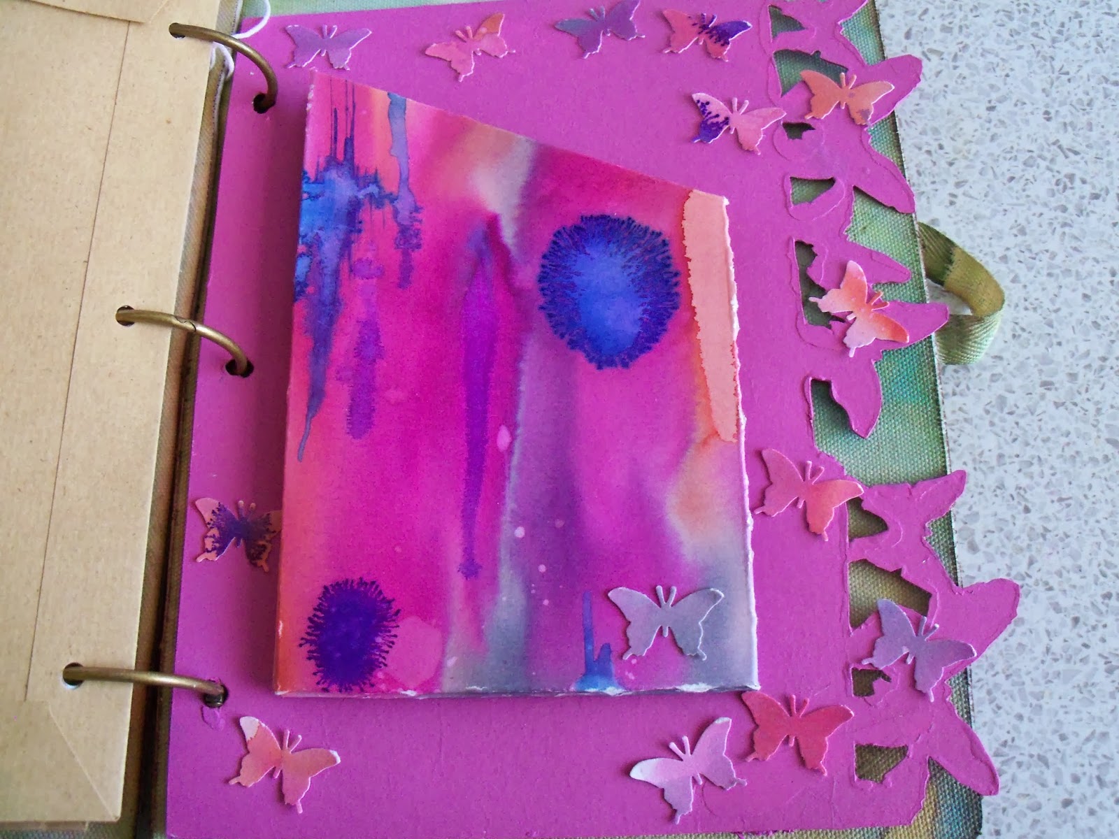
I made up a pouch for one of the dividers, using watercolour paper coloured with Brusho pigments on a Linda Knight session a couple of months back.  The colours looked right!  I also punched butterflies out of the remnants.  They glitter!  A lot!


Then I found some brown A5 envelopes, and covered them with matching gelli print papers - I think probably from an Andy Skinner session - but may have been with Linda Knight - in the pile of gelli print papers without a home...


A couple of other white A5 envelopes I tried something else...don't know why I haven't done this before...swooshed distress ink onto my mat, and instead of spraying with water, sprayed with pearl cosmic shimmer!  Wow!  Overstamped with a huge lace background stamp in a couple of different Archival inks, and then added some embellishments, which reflect my sister's great age (hah!  She'll kill me for that!!)  Land of The Giants...


On one of the envelopes, I had been playing with Stampboard - and a PaperArtsy stamp in several colours, and it fit with the theme.  So on it went!


Then I cut loads and LOADS of different papers to fit, and used my cropodile to hole punch them. 


To finish off, I used the remnants of one of the gelli papers and punched a scalloped edge.  I stamped the letters and the tags, then used he matching punch to punch them out.  Touch of stickles, and hey presto!  One birthday card, for an aged relative....  Yep, dead again!

Hope she likes!!

Resources (A selection...)

Prima Journal Covers, and various Prima embellishments - and other embellishments
Stampboard

Sizzix on the edge: Butterflies and Houses

Andy Skinner Mask (the children on the gelli plate)

Distress inks
Stewart Gill Paints
PaperArtsy Fresco paints
Brusho pigments
Cosmic Shimmers spray
Primary Elements, added to water, and sprayed, various colours

Stampin' Up: Tag stamp, and punch
Martha Stewart Butterfly punch
Hero Arts: Letter stamps
PaperArtsy Antique butterfly stamp

Sunday, 11 August 2013

Water water everywhere, and n'er a drop to drink!

Have I mentioned, I love Linda Knight??  Her workshops are just so relaxed.  It's not about replicating something of hers (as if!), it's all about the techniques.  This session was about water colouring - not the old master style, but how to use wet pigments to create amazing backgrounds.  There was a lot of water used for these.

I took along my brusho pigments, which I bought last year sometime.  I got a bit scared about using them....but not any more!!    Brushos are pure pigment in granular form, they come in little plastic pots, and you add water. I'm now thinking about adding them to white acrylic...hmm...

Our substrate was an A1 sheet of watercolour paper, ripped into three.  Most of the group bound them into books, but I haven't done this yet.  I worked on each of them as a land(or water)scape, so when I tried to fold them into the chapter for my book, the landscape got lost.  I want to create a few more pages, and perhaps bind it differently, so these pages will sit on the side for a while, while I cogitate on this further!

While I was working, one of the lovely ladies on the session suggested that I drop a tiny pinch of the granulated pigment into the wet background.  OMG!  As you can tell, I LOVED the effect this gave.

Then Linda showed us how to stamp with bleach (another one of those things I was scared to do - why???  Easy, and what great effects.  So, here are the outputs!

The first photos are of the sea page.  The wavy lines are a stamp - in bleach.  the speckles are the dry brusho sprinkled on the west background.


Now, this one...

It looked like a really stormy sky...so I dripped bleach through a pipette down the page, to get lightening!  It needs a tree at the bottom I think.


I knew as soon as I stamped the flower border at the bottom of this page, that it was going to be butterflies!


 Dragonflies, oh yes!  Several stamped in bleach, and a couple them over-stamped with pigments - I think this was inktense.

I put a dollop of mica powder into bubblegum dylusions, and painted it on for some dimension... you can just make it out, shimmering!


In real life, this one is lovely...but I'm not quite sure what it is yet!!


 This one is going to be dandelion heads I think.  You can see where I stamped a flower in bleach and in ink top left, if you squint a bit!!!


 This is all the leftovers from my palette!  with a couple of drops of drawing ink.  This is rigid with mica, and where I stamped my Dragonfly for the Craftbarn challenge  (different dragon fly - I need to get that big one from Linda!!  It is gorgeous and HUGE!!)

Hope you like!